Peaches: Brand Identity
Aug 2026
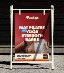
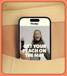
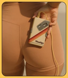
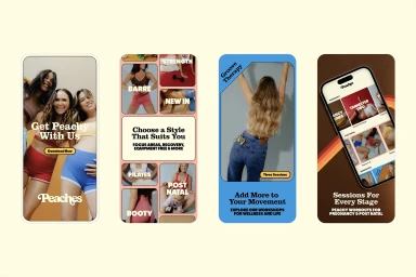
Peaches, a dynamic fitness, sports, and gaming brand, has successfully established a compelling brand identity that masterfully marries the high-energy demands of contemporary wellness with a nostalgic, 1970s-inspired aesthetic. Through a sophisticated visual language, the project employs a warm palette of deep chocolate browns, vibrant reds, and soft creams to cultivate an environment that feels both professional and intimately inviting. The branding effort relies heavily on seamless motion graphics and fluid animation, which bring a playful, rhythmic quality to the studio experience. By integrating live-action technique with bold, retro-inspired typography and geometric layouts, the design team creates a cohesive narrative that spans from social-ready video montages to mobile-first UI illustration. With creative contributions from the team at Bandit Design Group, motion work by Sophie Roberts, web development by COG Marketing, and evocative photography by Emma Tkalcevic, the result is a polished system that remains grounded in the physical reality of movement. This identity channels a community-focused energy, using sharp cuts and lifestyle-oriented visuals to emphasize that fitness is an immersive, daily ritual. Whether through the clean, corporate-leaning web interface or the whimsical 3D rendering of a motel-style keychain, the brand successfully positions itself as a destination for those seeking a vibrant, lifestyle-integrated approach to health, proving that structured design can feel inherently human and entirely addictive.
Commercial, Retro
Solid Colour
Brand Film / Corporate Video