
Ovarian Cancer Action: Brand Identity






Aug 2024
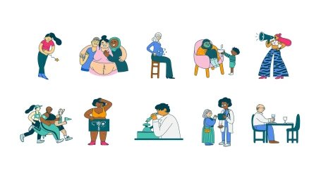
Ovarian Cancer Action commissioned a comprehensive brand identity project to revitalise the non-profit's visual presence. Developed in collaboration with Revolt London and illustrator Cécile Dormeau, the identity leans into a bold, character-driven aesthetic that translates across physical merchandise, digital interfaces, and motion graphics. The system utilizes a vibrant palette of teal, pink, and yellow, anchored by clean typography and custom vector illustrations. These graphic assets appear throughout the campaign, from tactile print materials like tote bags and annual reports to animated sequences featuring fluid motion design. By pairing direct, accessible messaging with stylized imagery, the project focuses on clarity and public engagement. The execution maintains a consistent visual language across all platforms, utilizing natural light in editorial photography and sharp, high-contrast motion graphics to deliver information with impact.
Commercial, Clean, Horizontal
Advertising Campaign

