
Oraa: Brand Identity
Jun 2025
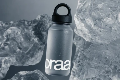
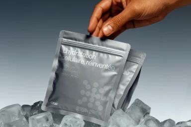
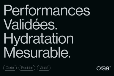
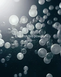
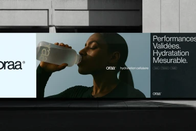
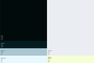
The Oraa brand identity project, led by Studio FORMAT, establishes a minimalist and contemporary visual system for the consumer health brand. The identity centers on a clean, technical aesthetic, utilizing a restricted palette of black, steel blue, and pale yellow to reinforce a focus on hydration and cellular wellness. The project spans across physical product photography, outdoor billboard advertisements, and motion graphics. Studio FORMAT employs 3D render and CGI techniques to present the product line—which includes frosted water bottles and metallic wellness pouches—within pristine, icy settings that emphasize freshness. Graphic design assets, including typography-led posters and structured brand guidelines, prioritize a precise, modern layout. Motion design sequences integrate fluid organic shapes with clean sans-serif type to communicate brand messaging, maintaining a consistent minimalist tone across both static and animated digital touchpoints.
Commercial, Clean, Horizontal
Solid Colour
