
Oma Appel: Brand Identity


Jul 2023
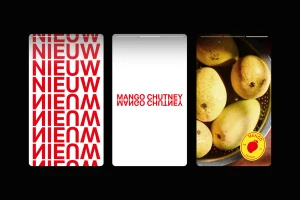
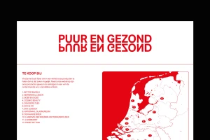
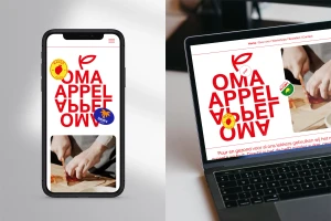
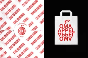
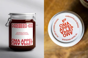
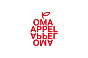
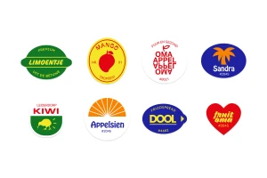
The brand identity for Oma Appel establishes a cohesive visual language across packaging, digital assets, and environmental collateral. Developed by Studio Deploy, the system leverages high-contrast typography and a signature mirrored logotype that forms an apple silhouette, grounded in a palette of bold red against clean white and neutral backdrops. Techniques such as vector-based graphic design and minimalist layout strategies ensure a consistent application from product labels and shopping bags to website interfaces. The work integrates editorial photography of fresh produce within the CPG sector, maintaining a crisp aesthetic that balances playful sticker elements with a structured, symmetrical hierarchy.
Clean, Commercial
Typography, Vector
White Seamless
Advertising Campaign
