
Olicatessen: Brand Identity



Jul 2026
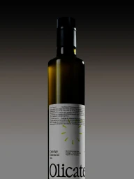
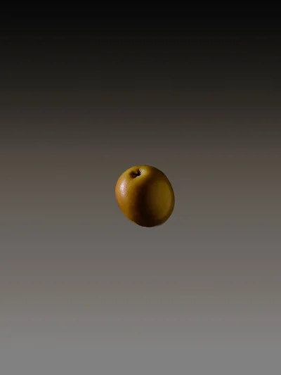
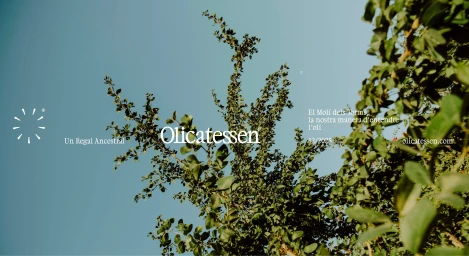
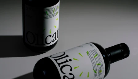
The brand identity for Olicatessen serves as a masterclass in modern CPG design, balancing organic heritage with a clinical, high-end aesthetic. Executed with a focus on editorial minimalism, the project elevates the humble olive oil category by stripping away visual clutter to prioritize form and texture. The branding leans into a sophisticated palette, utilizing high-contrast studio strobe photography to define the silhouette of the product against seamless, soft-focus gradients. This commercial approach is anchored by refined serif typography, which grounds the packaging in a sense of timeless quality while small, vibrant neon green graphic accents provide a necessary jolt of contemporary energy. The composition frequently employs macro techniques to highlight the waxy, natural texture of individual olives and branches, bridging the gap between raw natural origin and processed, premium retail reality. With comprehensive design work by Plakton and digital infrastructure support from Gassiot & Llobet, the brand identity project succeeds by treating every visual touchpoint—from the matte-finish paper labels to the deliberate interplay of light and shadow—as a piece of intentional art. By synthesizing natural light vignettes with controlled studio imagery, the identity establishes Olicatessen as a premium player in the food and beverage space, creating a visual language that is as crisp and clean as the oil it represents.
Commercial, Minimalist, Clean
Soft Light

