
Baró i Fills
Brand Identity
Jul 2026
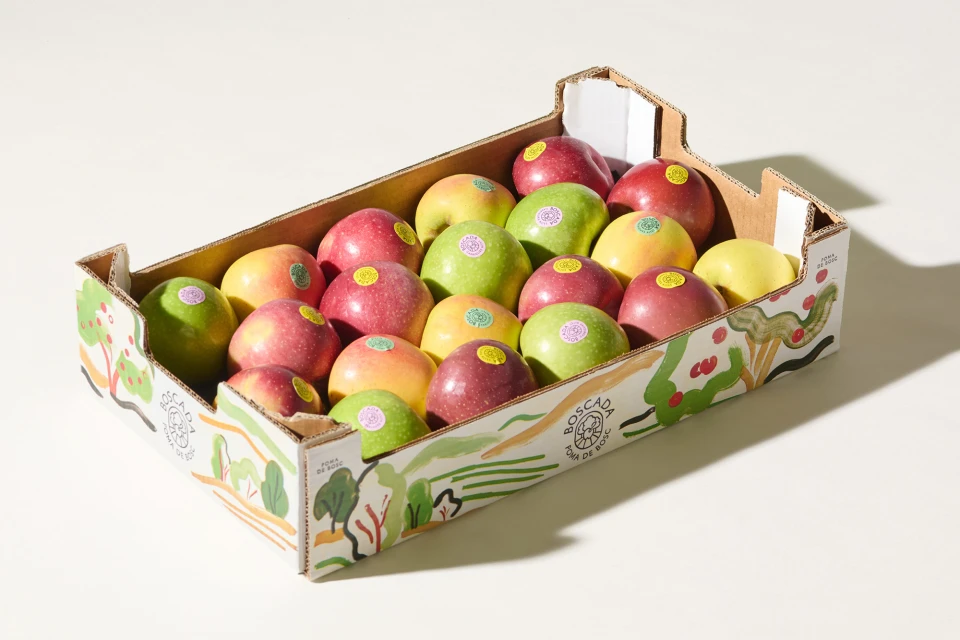
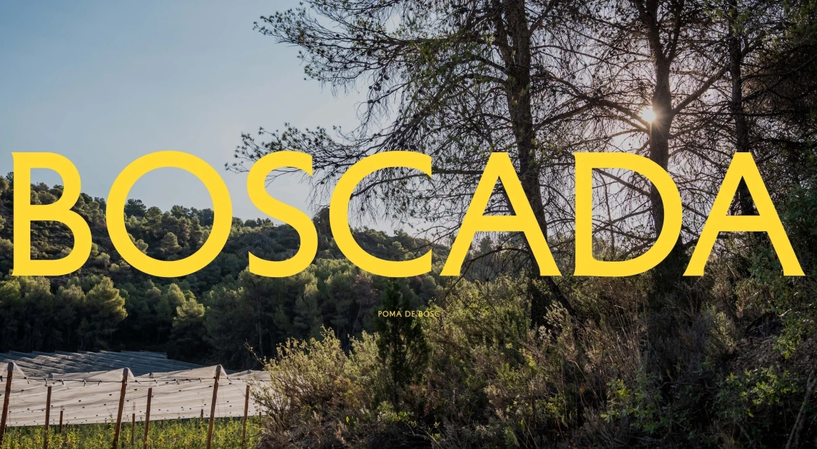
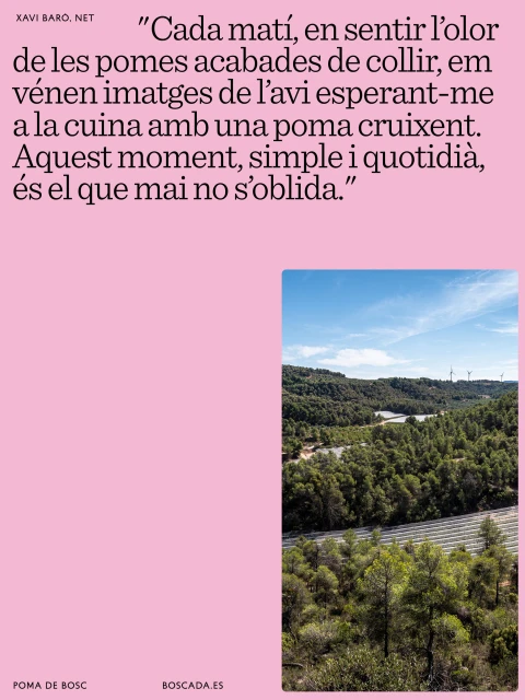
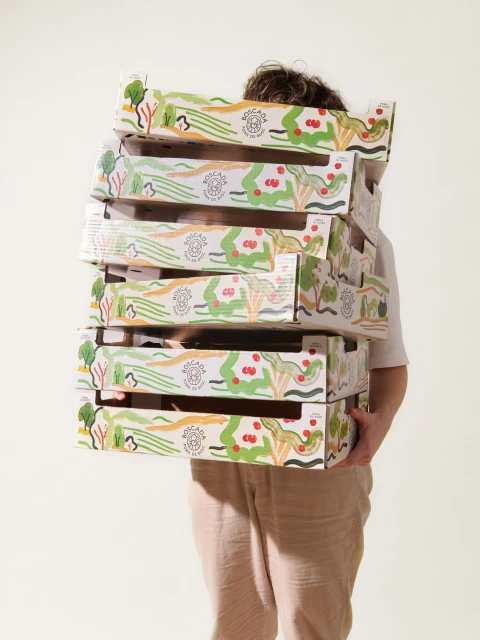
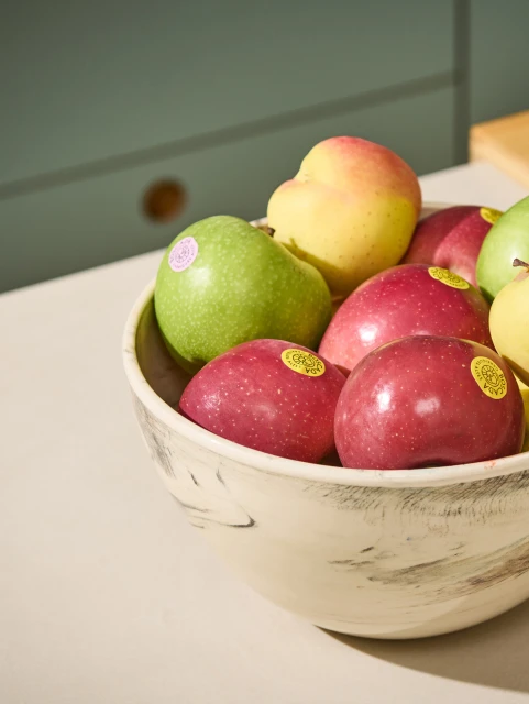
The brand identity project for Baró i Fills masterfully bridges the gap between agricultural tradition and contemporary design within the competitive CPG and packaged food sector. By weaving together a narrative of nature and memory, the creative team at Plakton has developed a cohesive visual language that feels both grounded and aspirational. The execution leans into a clean, editorial minimalism, utilizing significant negative space and a refined serif-heavy typographic approach to ground the brand narrative. Through the intentional use of commercial studio strobe techniques, the studio-lit photography highlights the tactile quality of the produce, contrasting the vibrant crimson and lime hues of the fruit against neutral, off-white backdrops. This balance is further explored in the lifestyle assets, which capture a harmonious interplay between natural light and graphic industrial elements, such as the stylized botanical illustrations adorning the cardboard crates. The project successfully pivots between functional product showcase and high-concept storytelling, using bold yellow sans-serif typography to anchor the brand identity within its rural landscape roots. By marrying the simplicity of linen-clad portraiture with the refined sophistication of marble-set still lifes, the campaign creates a versatile design system that feels authentic to the origins of the food while remaining perfectly polished for modern, design-conscious retail shelves.
Commercial, Clean, Vertical
CPG / Packaged Food
