
Nostrum: Brand Identity
Aug 2020
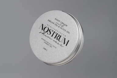
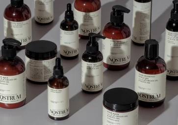
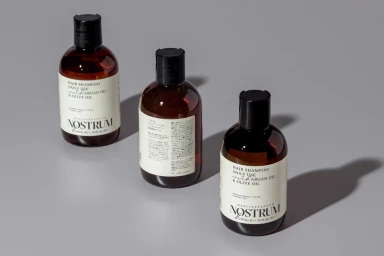
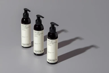
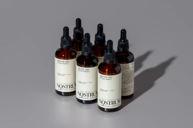
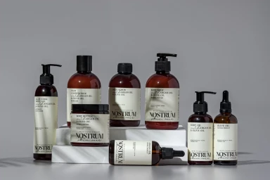
Nostrum represents a masterclass in clean, intentional brand identity design, specifically crafted to elevate its presence within the competitive skincare and beauty sector. The visual language of the project moves beyond mere product display, leaning into an aesthetic of editorial minimalism that feels both clinical and approachable. Through a series of highly structured studio shots, the brand identity establishes a cohesive narrative that emphasizes the purity of its Mediterranean-inspired formulations. By utilizing a restrained palette of amber glass, metallic silver, and off-white labeling, the photography channels a sophisticated, professional atmosphere. Key techniques such as soft light and cinematic lighting are employed to define the physical form of the packaging, ensuring that every pump bottle, dropper, and circular tin feels like an essential design object rather than just a commodity. The deliberate use of sharp shadows and balanced compositions on seamless grey surfaces brings a sense of depth and tactile reality to the collection. Graphic design expertise from The Birthdays Design anchors the project, ensuring that the elegant serif typography remains the focal point across every application. The result is a refined commercial visual suite that communicates quality and dermatological precision, perfectly positioning Nostrum as a contemporary leader in the beauty space while maintaining a timeless, high-end appeal that resonates with a discerning, design-conscious audience.
Horizontal, Commercial, Clean, Minimalist
Natural light
Grey Seamless
E-commerce / Product
