
Athens' Burger Fest: Brand Identity



May 2020
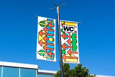
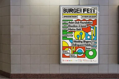
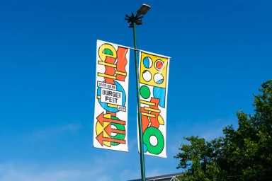
For the Athens Burger Fest 2019, The Birthdays Design crafted a comprehensive brand identity that masterfully bridges the gap between urban event infrastructure and playful, high-contrast visual communication. By leaning into a vibrant, primary-color palette of red, blue, yellow, and green, the design system transforms static festival assets into dynamic markers of energy and excitement. The project utilizes a rigorous approach to typography, pairing bold sans-serif lettering with abstract geometric motifs such as arrows, circles, and bars to maintain a clean yet expressive visual rhythm across diverse applications. From environmental branding on suspended banners and modular cube installations to functional wraps on entry turnstiles and bus shelter billboards, the identity feels both cohesive and ubiquitous within the cityscape. This commercial project succeeds by treating utilitarian event signage as a canvas for modernist-inspired expression, effectively weaving corporate information into a broader, playful aesthetic. By utilizing natural light to accentuate the flat, vector-based graphic lines, the team ensures that the festival presence remains legible and punchy even in complex outdoor settings. Ultimately, the work stands as a testament to the power of environmental brand design, where every element—from the striking signage in the park to the temporary outdoor structures—contributes to a unified, immersive experience that perfectly captures the spirit of the celebration.
Horizontal, Commercial
Advertising Campaign
