
Niko: Brand Identity

Jun 2023
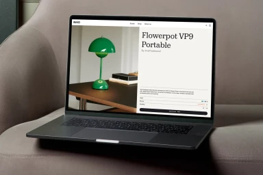
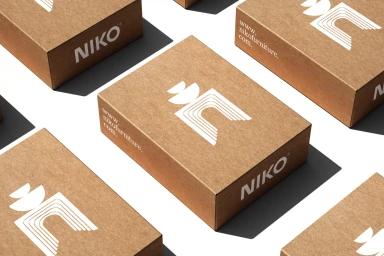
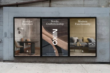
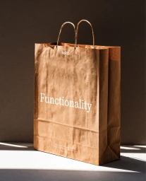
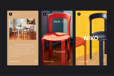
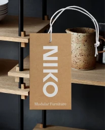
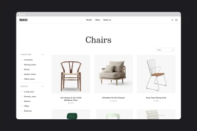
Niko’s brand identity project establishes a visual language centered on clean, minimalist typography and a structured, geometric aesthetic. Designed by Blair Hodge, the identity spans across digital, print, and physical touchpoints, utilizing a palette of neutral tones and tactile materials to highlight the brand's focus on modular furniture and craftsmanship. The project incorporates professional graphic design, motion graphics, and UI illustration to maintain consistency across e-commerce interfaces and retail collateral. Executed with a focus on high-contrast lighting and clean layouts, the brand system is applied to everything from packaging and kraft paper tags to large-format advertising posters and digital mockups.
Horizontal, Commercial, Clean
