
Nia Centre: Brand Identity

Mar 2024
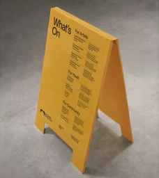
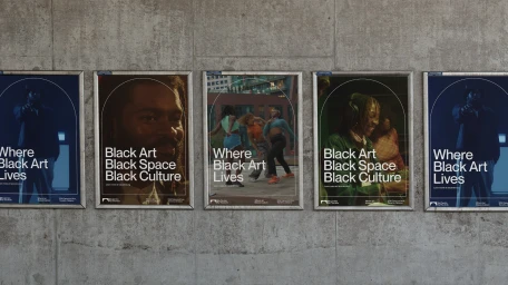
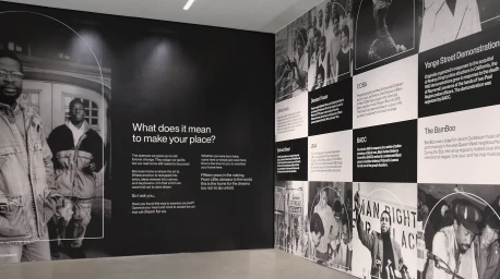
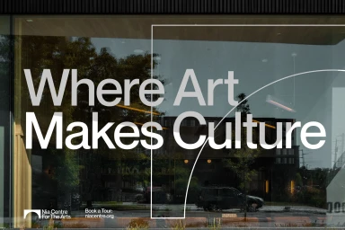
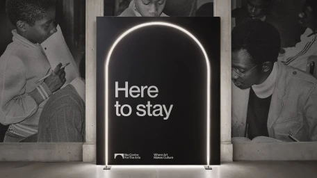
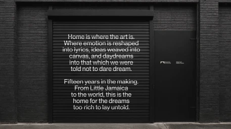
JOAN Creative developed the comprehensive brand identity for Nia Centre for the Arts, centering on a cohesive system of minimalist typography and structural arched motifs. The project spans diverse applications, from large-scale outdoor digital billboards and environmental signage on industrial facades to curated interior exhibition displays. The visual language leans into a monochrome palette punctuated by bold yellow highlights, utilizing clean graphic layouts to establish a modern, institutional presence. Motion graphics further extend the identity through kinetic typography animations that translate the organisation's core messaging into fluid, screen-based narratives. Throughout the execution, the work maintains an editorial clarity that balances historical photographic documentation with contemporary design techniques.
Commercial, Clean, Minimalist, Horizontal
Typography
