
NEARCON: Brand Identity
Jan 2023
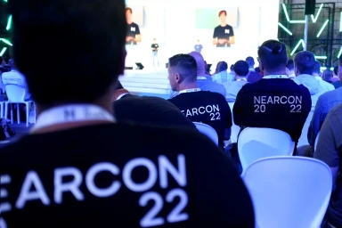
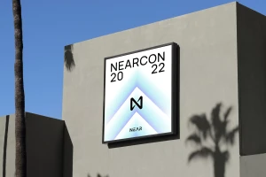
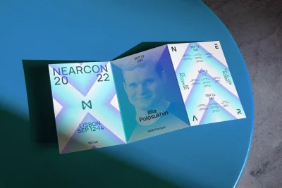
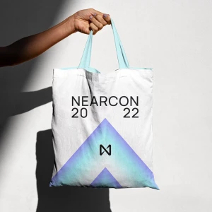
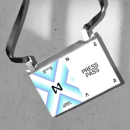
The brand identity for NEARCON, designed by Fold7, establishes a cohesive visual language across both physical event collateral and digital interfaces. The system leans into a modern, minimalist aesthetic defined by a gradient-driven color palette of blue, white, and iridescent tones, paired with clean geometric typography. Execution spans a variety of applications, from outdoor signage and printed brochures to branded apparel and press passes. The project incorporates motion graphics that utilize shifting diagonal lines and pulsing emblems to maintain a professional, tech-forward presence. Through the use of natural light and consistent graphic layouts, the identity adapts effectively from static print media to live-action conference settings.
Commercial, Clean, Horizontal
