
Mónica Rikić: Brand Identity
Brand
Date
Nov 2023
Description
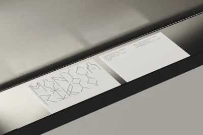
Mónica Rikić’s brand identity project establishes a visual language centered on precision, geometric modularity, and minimalist typography. Developed with graphic design by Thru, the identity employs clean, linear vector-based forms and a monochromatic palette to convey a refined technological sensibility. The project incorporates motion graphics and digital interface design, utilising typewriter effects and terminal-style fonts. The visual system extends across various media, from physical collateral like business cards with custom typographic treatments to dynamic motion sequences presented on dark, grid-based backgrounds.
Style
Horizontal, Minimalist
Techniques
Motion Graphics
Industries
Color
Pure White
Jet Black
Context
Brand Film / Corporate Video
Associated creatives

5000+ creatives to discover
Sign up to gain access to the entire directory. It’s free.
Visie is a curated library of creative professionals.