Logo
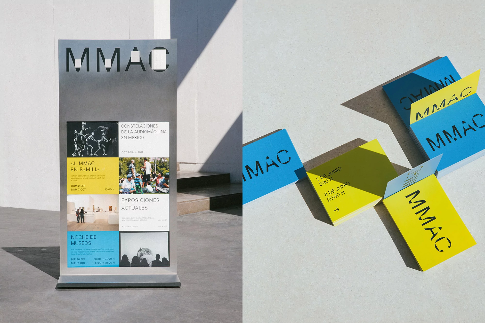
Split image showing a metallic MMAC signpost next to folded bright blue and yellow printed stationery on a pale concrete ground.
Close-up of a lanyard pass with the MMAC logo and a wide shot of a man sitting on a wooden bench in a modern interior.
Two architectural views of the white concrete building exterior featuring signage for MMAC and Museo Morelense de Arte Contemporáneo Juan Soriano.
Exterior architectural signage for MMAC featuring bold typography on white walls and a dark door labeled T3.
Motion blur figure walking past a marble reception desk beneath three digital screens displaying MMAC branding.
Scattered yellow rectangular cards featuring black MMAC stencil typography against a neutral background.
Modern white concrete building exterior featuring the MMAC logo and clear geometric architectural lines under a blue sky
Flat lay photograph of MMAC brand identity stationery in white and bright yellow featuring bold typography.
Interior architectural view displaying white brick texture, wooden furniture, and clean typography signage.
Brown exhibition catalog featuring Gustavo Perez Monzon typography and photography on a light stone surface
Split image showing a metallic MMAC signpost next to folded bright blue and yellow printed stationery on a pale concrete ground.
Close-up of a lanyard pass with the MMAC logo and a wide shot of a man sitting on a wooden bench in a modern interior.
Two architectural views of the white concrete building exterior featuring signage for MMAC and Museo Morelense de Arte Contemporáneo Juan Soriano.

MMAC Brand Identity 2019

About

The brand identity project for the Museo Morelense de Arte Contemporáneo Juan Soriano (MMAC) stands as a masterclass in institutional design, balancing the rigid requirements of wayfinding with an approachable, contemporary visual language. Developed by the team at Sociedad Anonima, the identity leans into a bold, minimalist aesthetic that anchors the museum's complex architectural forms. By leveraging a high-contrast palette of vibrant yellow and stark black, the designers have created a versatile system that thrives across disparate mediums, from large-scale exterior signage and architectural wayfinding to delicate stationery and exhibition catalogs. The work makes expert use of strong typography, employing a sans-serif and stencil-based system that remains consistent whether applied to polished stone walls or matte-textured paper stocks. Through a cinematic approach to documentation, the project showcases the identity in natural light, emphasizing how the clean geometric layouts interact with the museum's modern concrete structures and lush surrounding foliage. The design strategy successfully facilitates navigation while reflecting the institution's role as a living cultural space. By integrating live-action techniques—such as subtle slow-motion captures of daily museum life—the identity feels grounded, functional, and deeply embedded within the architectural environment. This comprehensive design solution demonstrates how rigorous graphic standards can elevate the visitor experience, transforming administrative information into a cohesive, tactile extension of the museum's artistic vision.

Brand

Credits

Styles

Techniques

5000+ profiles to discover

Sign up to gain access to the entire directory. It’s free.

Visie is a curated library of creative professionals.
Trusted by