
Method
Brand Identity

Mar 2026
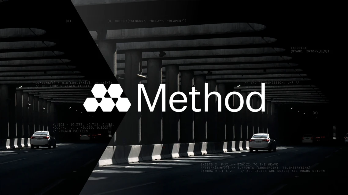
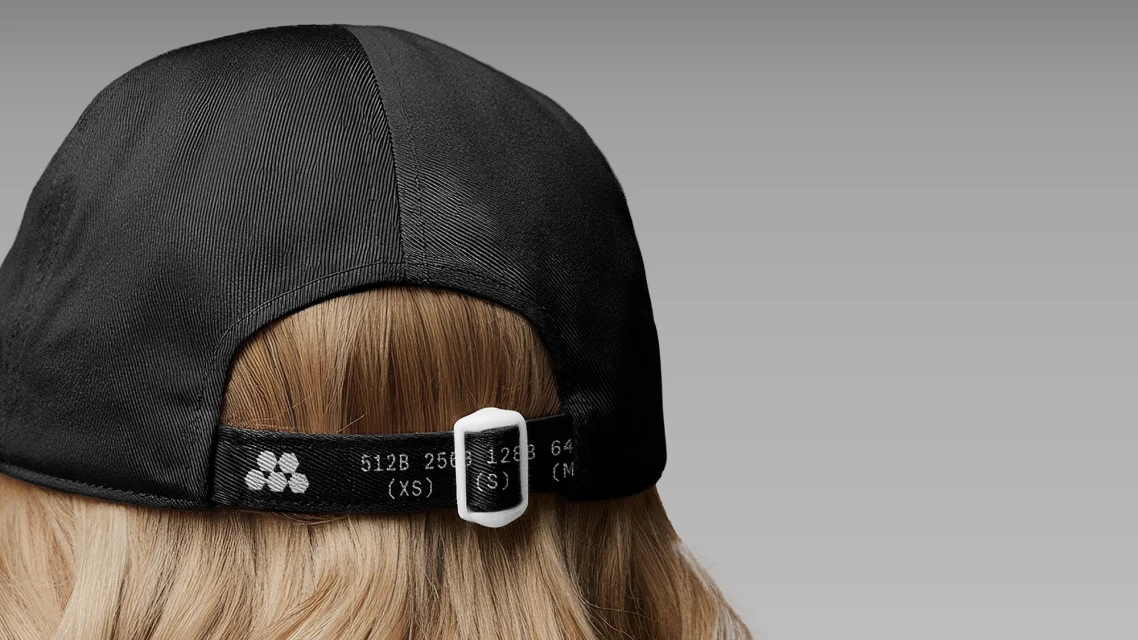
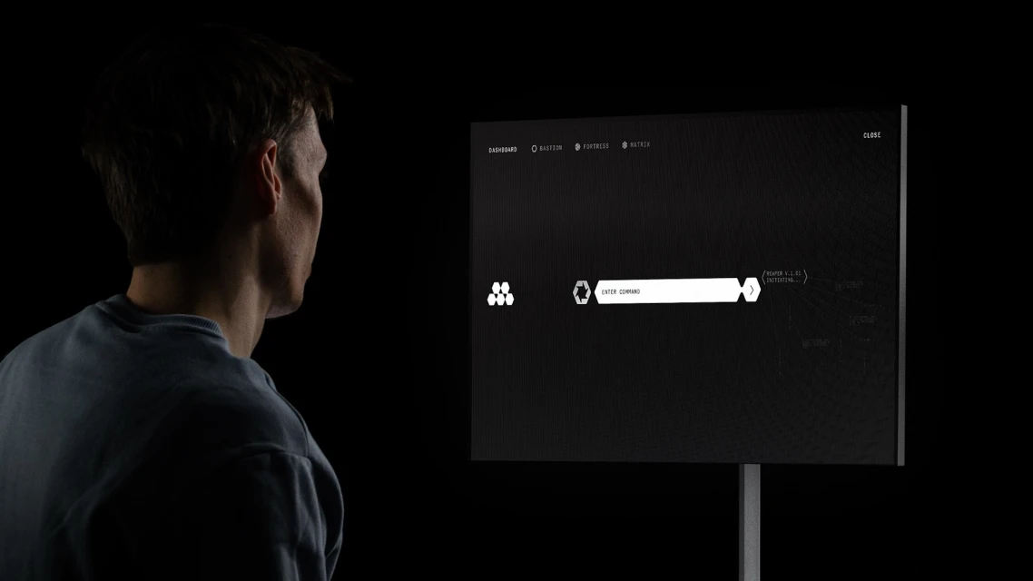
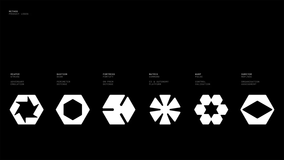
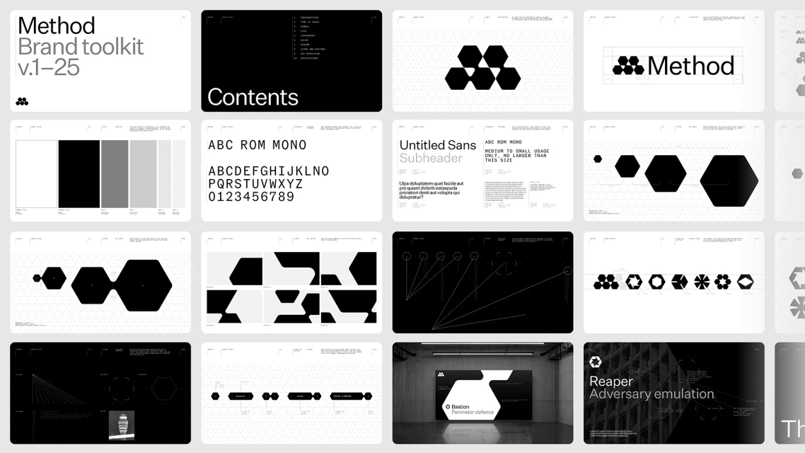
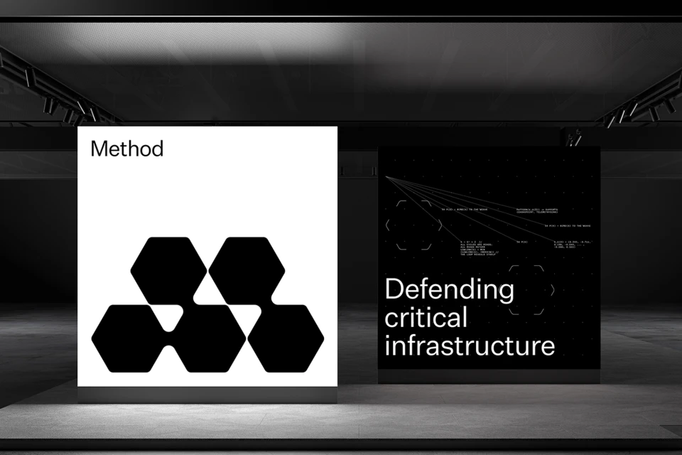
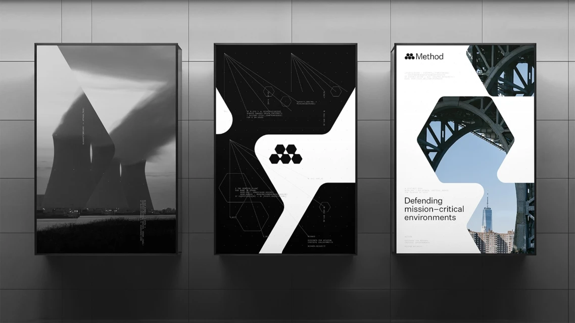
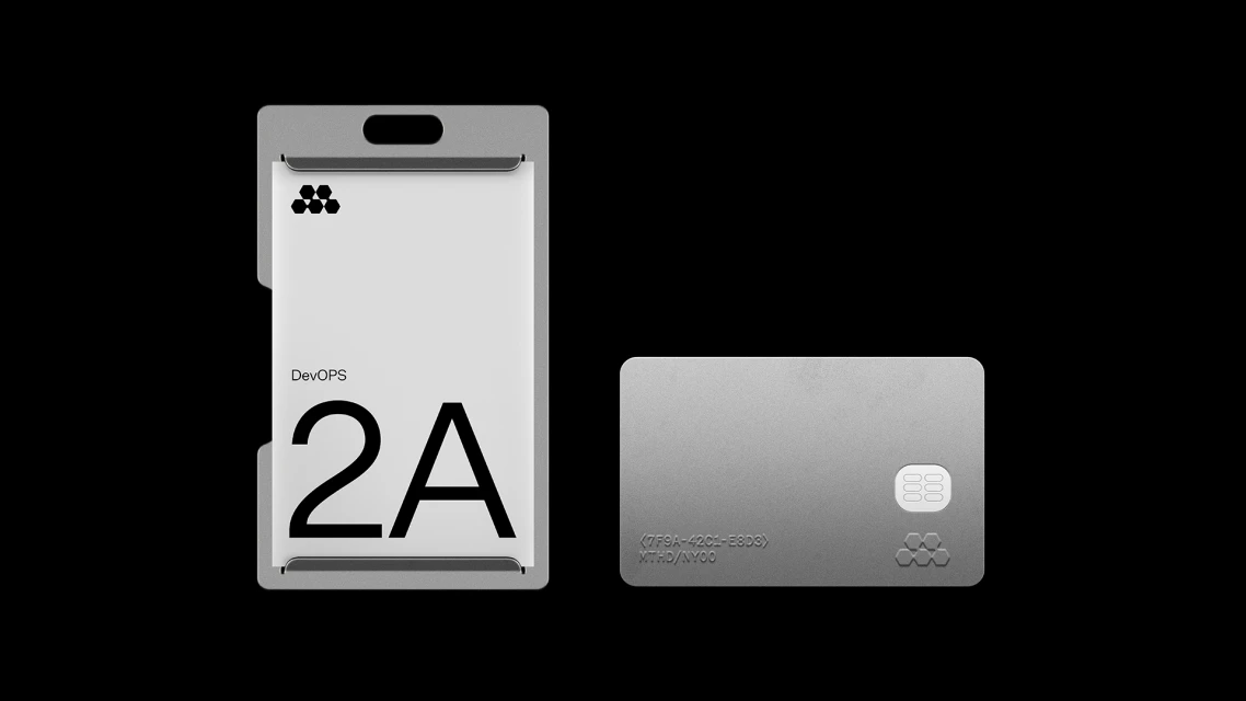
Method has unveiled a comprehensive brand identity that masterfully bridges the gap between complex enterprise software and high-impact visual storytelling. This corporate project leans into a rigorous, minimalist aesthetic, where the precision of high-end design systems meets the high-stakes world of cybersecurity. By utilizing a stark monochromatic palette and a recurring hexagonal motif, the team has established a visual language that feels both authoritative and deeply technical. The execution relies on a sophisticated interplay of cinematic chiaroscuro lighting and crisp typography, notably leveraging the ABC Rom Mono typeface to reinforce a sense of system-driven logic. Throughout the brand toolkit, the integration of 3D render and CGI elements provides a tangible, futuristic texture that speaks to the software's capability in defending critical infrastructure. The narrative is further punctuated by strategic use of vector diagrams and code fragments, which ground the branding in a functional, data-heavy reality. Designers Studio zur Strassen, Benjamin Lee, and Mark O’Neill, alongside motion specialist Paris Seawell and web developer Emti, have successfully constructed an identity that feels less like marketing and more like an essential operational component. This cohesive visual strategy signals that Method is a formidable player in the technology sector, transforming abstract digital security concepts into a tangible, high-contrast experience that commands attention across both digital interfaces and physical environments.
Horizontal, Clean, Commercial
Brand Film / Corporate Video


