
Menkind
Brand Identity

Brand
ProjectBrand Identity
Date
Sep 2026
Description
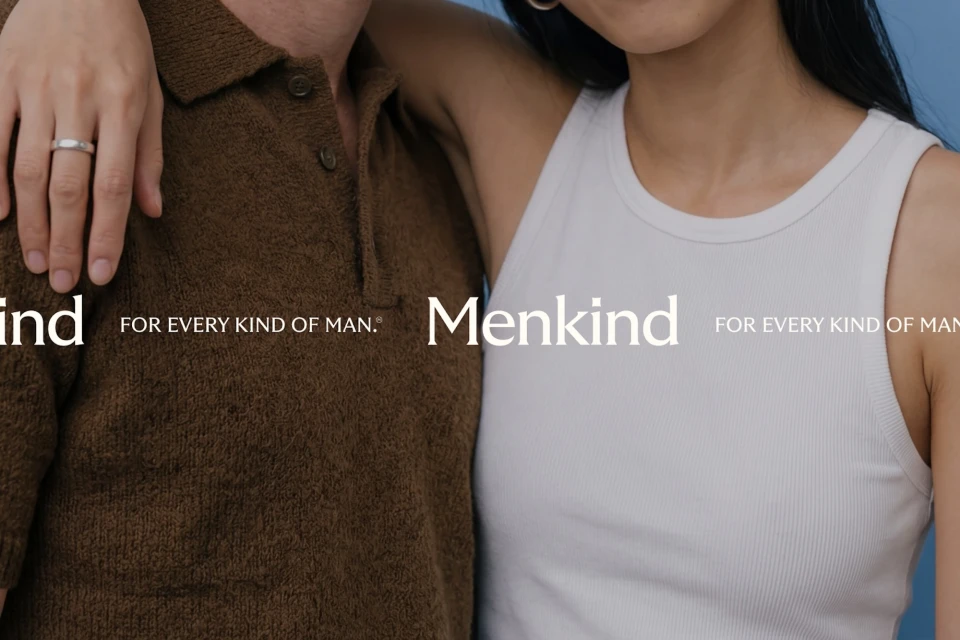
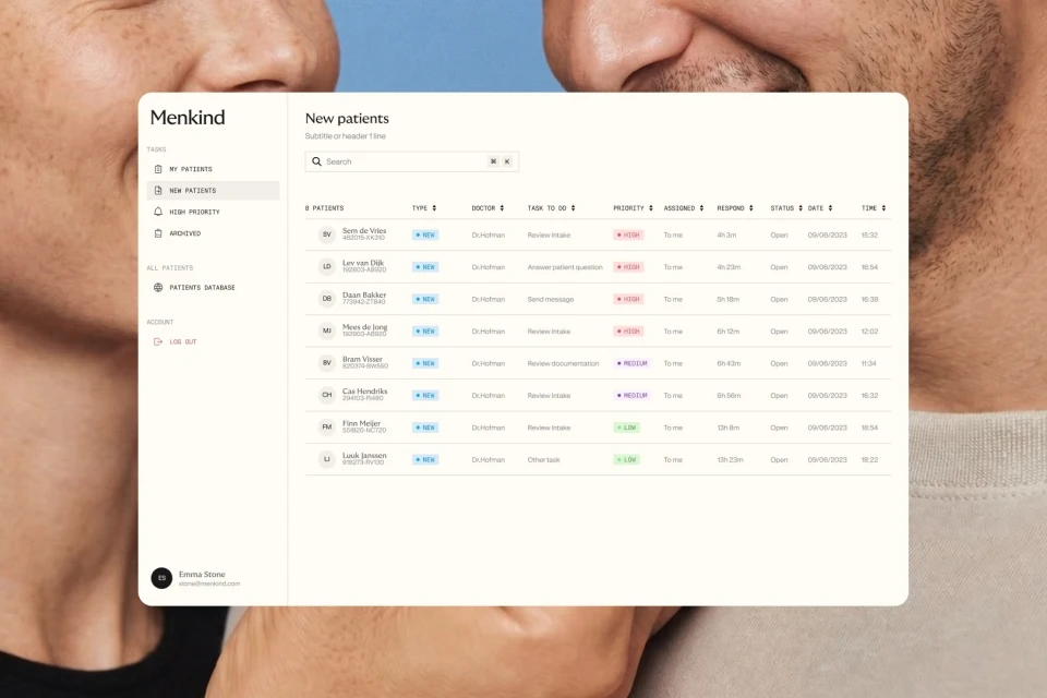
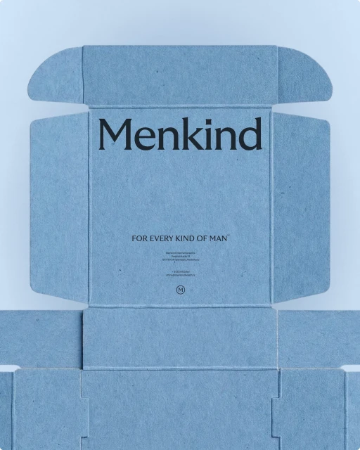
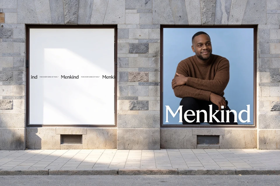
The Menkind brand identity, designed by Analogue, establishes a clean and minimalist visual system for the healthcare space. The identity centers on a high-contrast palette and disciplined typography to support a range of touchpoints, from digital patient management interfaces to tactile physical packaging. Execution across the project leans into a mix of hard and soft studio lighting techniques. Print collateral utilizes textured paperboard with precise die-cut forms, while signage applications integrate directly into existing stone-facade architecture. The visual language is applied across both web-based UI illustrations and commercial-focused product photography.
Style
Commercial, Minimalist, Clean, Horizontal
Associated creatives

5000+ creatives to discover
Sign up to gain access to the entire directory. It’s free.
Visie is a curated library of creative professionals.