
Mayor of London's Design Advisory Group
Brand Identity




Dec 2017
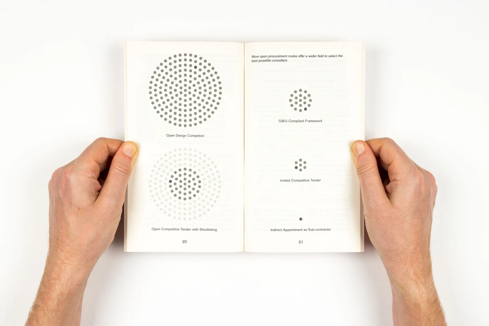
The brand identity for the Mayor of London's Design Advisory Group is a masterclass in functional elegance, bridging the gap between rigorous urban policy and accessible public communication. Under the expert graphic design guidance of Maddison Graphic, the project establishes a cohesive visual language that feels both authoritative and approachable. The editorial design relies on a sophisticated grid system, pairing crisp sans-serif typography with a dynamic palette of cyan, pale pink, yellow, and tan to distinguish various themes from ageing populations to urban growth. By utilizing minimalist isometric illustrations, halftone dot-matrix patterns, and strategic white space, the identity avoids the typical sterility of corporate literature, opting instead for a tactile, human-centered aesthetic. The physical collateral—composed of booklets and brochures—leverages natural light in its presentation to emphasize the high-quality print finishes and textured paper stocks. Throughout the series, the interplay of abstract monochrome geometric collages and technical architectural diagrams reinforces the organization's role in shaping London's complex public realm. This commercial body of work serves as a prime example of how data-driven information can be synthesized into an engaging, high-level corporate brand identity, proving that complex urban planning documentation can be as visually compelling as it is informative and utility-focused for the various stakeholders involved in the city’s ongoing evolution.
Clean, Minimalist, Horizontal
Typography
White Seamless
Editorial
