
Marie Antoinette
Rebrand
Nov 2025
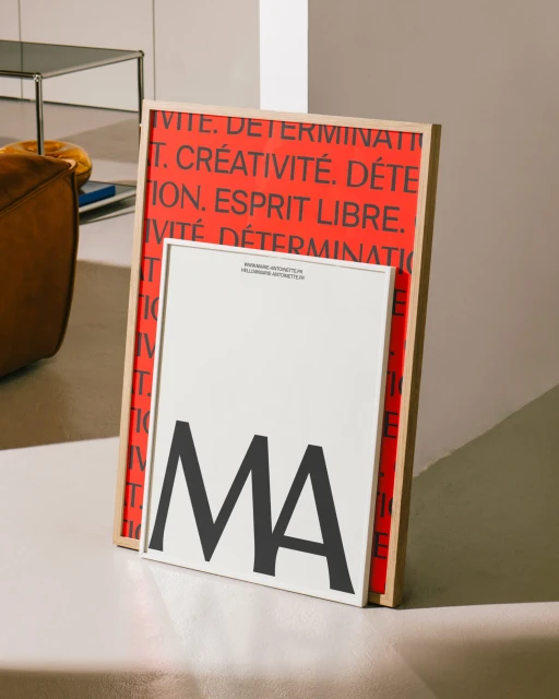
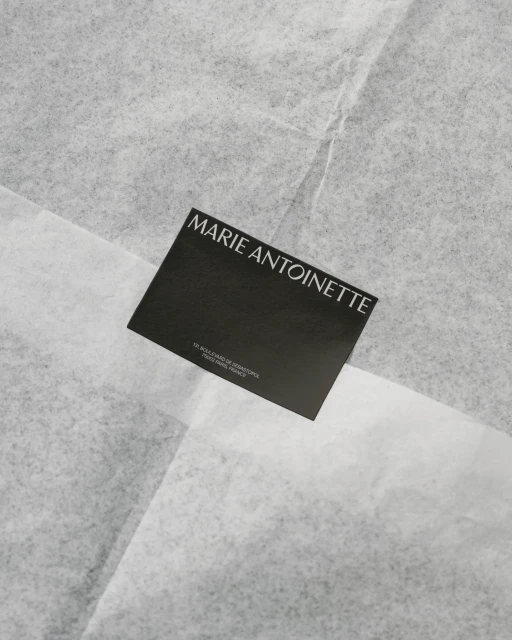
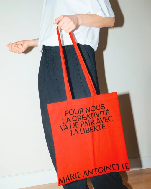
The rebrand for Marie Antoinette establishes a cohesive visual identity across both digital and physical touchpoints. The project spans stationery design, web interface development, and promotional collateral, all anchored by a minimalist aesthetic and a focus on typographic hierarchy. By leveraging bold serif letterforms and a monochrome palette with occasional red accents, the design language maintains a consistent, sophisticated tone. Execution relies on a blend of motion graphics and live-action sequences to demonstrate the system in practice. Local Studio handled the graphic design and web development, creating grid-based layouts and responsive mockups that transition between screen-based interfaces and printed materials. The final output highlights a contemporary approach to brand identity that prioritizes clean lines and clear communication.
Clean, Vertical
