
Mandarin natural Chocolate
Brand Identity
Feb 2016
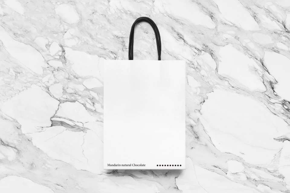
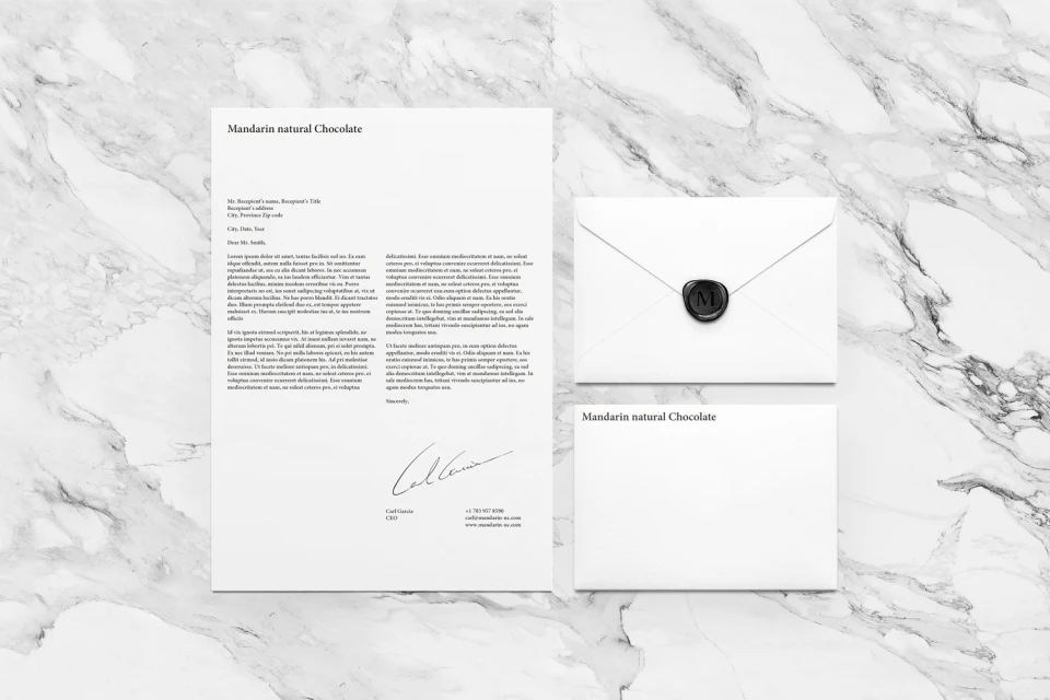
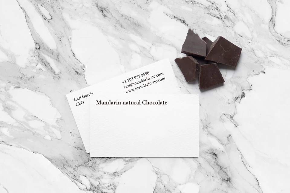
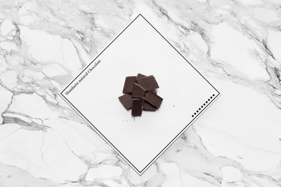
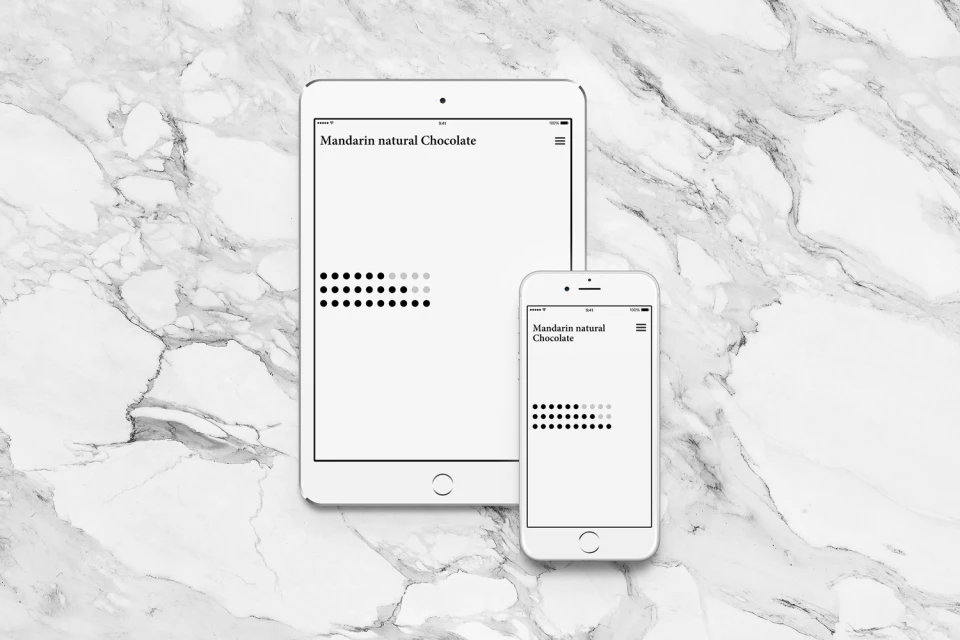
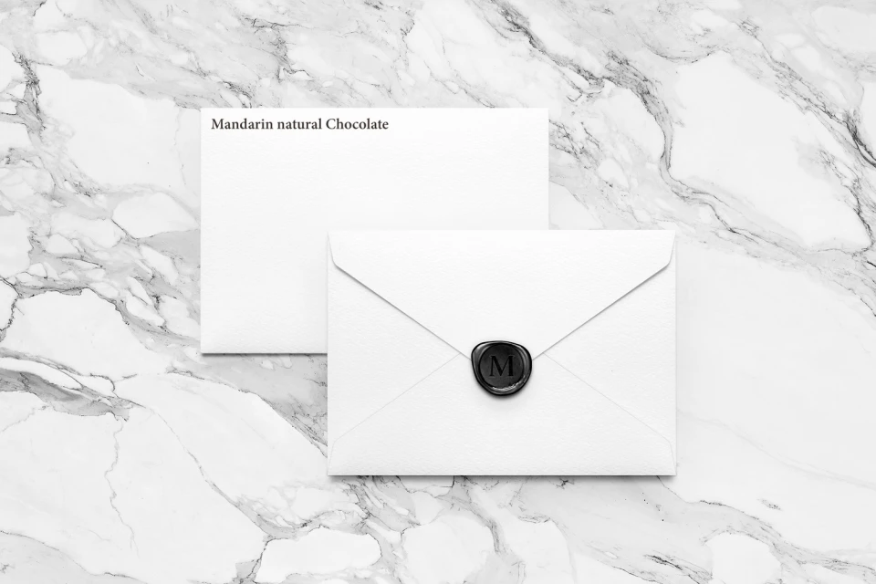
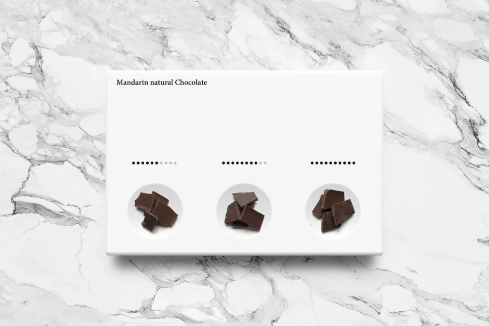
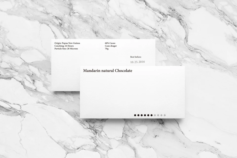
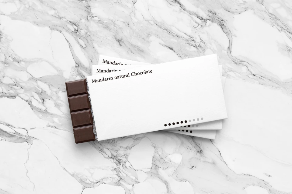
The brand identity for Mandarin natural Chocolate signals a sophisticated shift in the CPG packaged food space, moving away from traditional clutter toward a vision of editorial minimalism. Through a series of clean, top-down compositions, the visual system establishes a high-end narrative defined by the deliberate contrast between organic, dark grey-veined marble surfaces and stark, matte white packaging. Graphic designer Yuta Takahashi anchors this aesthetic, utilizing a disciplined typography that leans into classic serif and clean sans-serif pairings to convey authenticity and precision. The execution relies heavily on natural light to highlight textures, creating a sense of luxury that feels both approachable and distinct within the competitive gourmet chocolate market. From the delicate application of black wax seals on stationery to the geometric precision of the tasting trays, the design identity maintains a rigorous consistency across all touchpoints, including digital displays and physical collateral. Techniques such as 3D render / CGI integration and professional studio strobe photography elevate the brand, ensuring that every element—from the layered chocolate bar stacks to the detailed product specifications on wrappers—feels considered and intentional. By stripping away extraneous noise, the project succeeds in letting the product itself become the focal point of a balanced, highly professional corporate visual language that commands attention through sheer restraint and elegant composition.
Commercial, Clean, Minimalist, Horizontal
CPG / Packaged Food
Marble Texture
