
Mamco: Brand Identity

Apr 2019
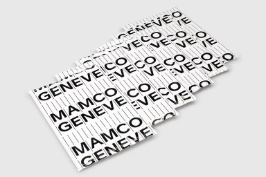
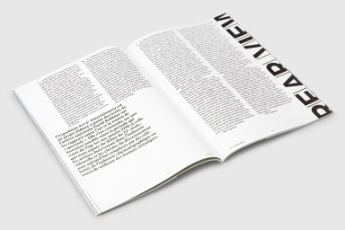
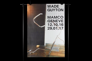
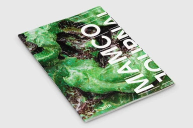
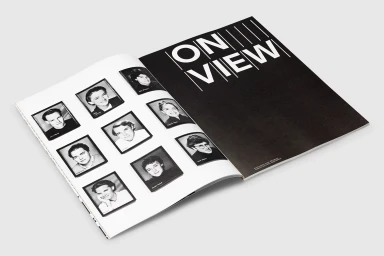
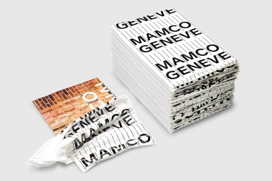
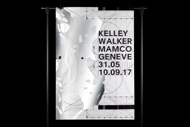
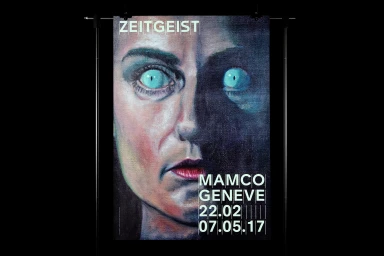
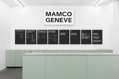
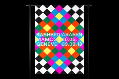
The brand identity for Mamco Geneve functions as a masterclass in institutional communication, balancing the rigid requirements of a contemporary art museum with a bold, uncompromising graphic sensibility. Orchestrated by Gavillet & Cie, the project leans into a rigorous grid-based composition that anchors the museum's visual output, from exhibition posters to internal signage. The design execution prioritizes typography, utilizing a striking, modern sans-serif typeface that repeats with clinical precision across various touchpoints. By employing techniques such as emboss and deboss, high-contrast monochrome layouts, and complex vector layering, the identity avoids the trap of sterile corporate branding. Instead, it channels an artistic ethos that feels both archival and urgent. The visual language oscillates between minimalist restraint—evidenced by the intersection of thin vertical lines and stark black-and-white wordmarks—and vibrant, illustrative outbursts that capture the zeitgeist of specific exhibitions. Whether featured on a meticulously stacked collateral piece or mounted on a sharp, black metal exhibition stand, the identity maintains a cohesive, architectural quality. This approach effectively bridges the gap between the functional needs of a digital media and entertainment institution and the creative unpredictability of the art world, resulting in an authoritative aesthetic that is at once functional, orderly, and deeply integrated into the museum's structural atmosphere.
Horizontal
Typography
Advertising Campaign
