
Kwangjuyo: Brand Identity


May 2026
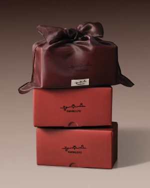
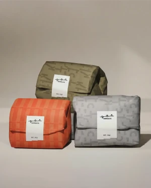
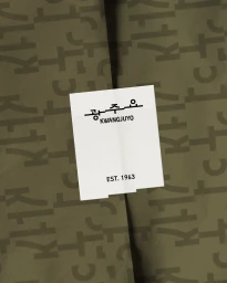
Kwangjuyo, the historic producer of premium Korean ceramics, has unveiled a refined brand identity that bridges centuries of tradition with a contemporary visual language. This comprehensive project, executed with design expertise from Clay Inc. and strategic direction from Be My Guest, repositions the brand as a leader in the culinary lifestyle space. The new identity is anchored by a sophisticated color palette—spanning muted red, olive green, and dark chocolate—that adorns meticulously crafted gift packaging. Through the lens of studio strobe photography, the branding emphasizes minimalist aesthetics and tactile material quality, with repeated typographic patterns and clean geometric arrangements defining the tactile experience of the unboxing process. Beyond the commercial product shots, the visual narrative incorporates documentary and reportage imagery captured on analogue film. These archival-style scenes, depicting the traditional kiln facility and its craftsmen, serve as a bridge to the brand's 1963 heritage, grounding the modern, minimalist design in authentic craftsmanship. By pairing high-contrast, macro-focused product imagery with the raw, historical context of its manufacturing environment, the brand identity creates a seamless tension between modern luxury and artisanal legacy. The result is a cohesive, cross-disciplinary visual system that elevates Kwangjuyo from a ceramic manufacturer to an aspirational lifestyle brand, perfectly balancing its deep-rooted cultural history with a sharp, forward-looking design sensibility.
Commercial, Horizontal

