
Kokoro Amsterdam: Brand Identity


Jan 2025
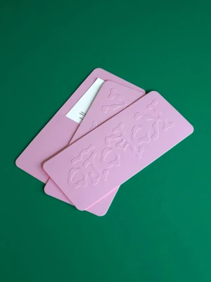
The brand identity for Kokoro Amsterdam centers on a synthesis of minimalist layout design and bold graphic illustration. Developed by 27b and Andrew Tseng, the project spans across physical stationery, apparel, and motion graphics. The execution leans into a vibrant color palette, utilizing emboss and deboss techniques on print materials to create tactile, clean compositions. Graphic elements, including vector-style animations and stippled ink illustrations, appear across both digital and physical touchpoints. Key assets include custom poster designs, apparel graphics, and web layouts that integrate photography with typography. The project maintains a cohesive visual language through consistent use of minimalist design and high-contrast color application.
Artistic, Vertical, Clean
Solid Colour

