
Kappa X: Brand Identity
Aug 2021
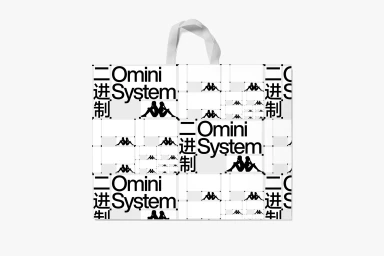
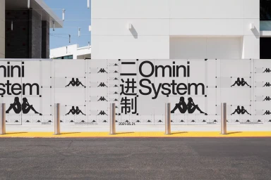
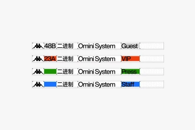
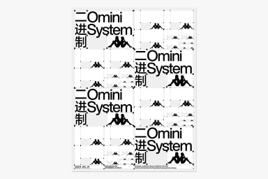
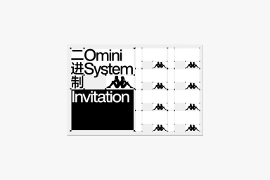
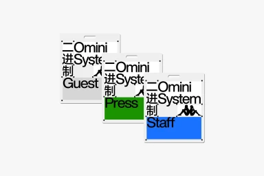
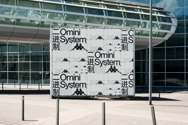
Workbyworks has developed a comprehensive brand identity system for Kappa X, centered on the Omini System. The project features a monochrome aesthetic that leverages bold typography and recurring logo motifs to establish a cohesive visual language across various media. By utilizing precise grid structures, the design system maintains consistency whether applied to small-scale event badges or large-scale architectural banners. The application of the Omini System prioritizes clean, minimalist graphic design, incorporating both English and Chinese characters to build a structured brand architecture. The project demonstrates functional versatility, with color-coded tiers for access control alongside detailed print and environmental applications. Each asset utilizes vector-style precision to highlight the sharp contrast between the minimalist typography and the surrounding spatial context.
Horizontal, Commercial, Clean
Typography, Vector
White Seamless
Advertising Campaign
