
Jorgobé: Brand Identity
Sep 2020
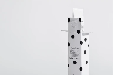
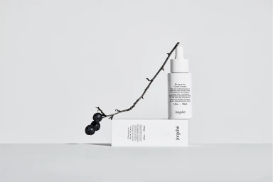
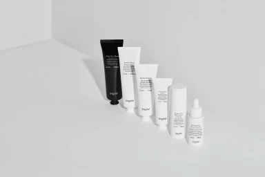
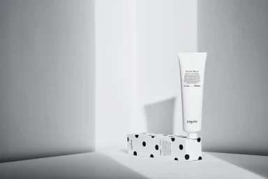
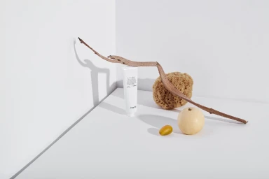
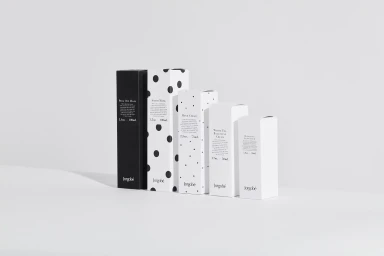
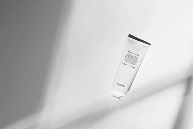
Jorgobé has long defined itself through a language of restraint, and this latest brand identity project further cements the label as a beacon of minimalist skincare. Captured with the clinical precision of Niklas Hoejlund Studio, the photography leans into a high-key, monochromatic aesthetic that feels both professional and inherently modern. By marrying the stark, geometric lines of the packaging—notably the iconic polka-dot motifs and crisp serif typography—with carefully curated organic elements like raw wood and citrus, the visuals evoke a sense of quiet luxury. The art direction, supported by the graphic design expertise of Homework, emphasizes a coherent design language that translates seamlessly across the entire product range. Through the use of natural light and soft, diffused shadows, the imagery avoids the sterile trap of traditional corporate advertising, instead opting for a cinematic approach that highlights texture and form. Whether through solitary, angled product shots or precise, ascending compositions, the work channels an editorial minimalism that feels entirely at home in the competitive beauty market. Each frame serves as a testament to the power of deliberate, uncluttered branding, where every shadow and surface is meticulously considered to reinforce the brand's identity as a clean, sophisticated player in the premium skincare space.
Commercial, Clean, Minimalist, Horizontal
Natural light
White Seamless
E-commerce / Product

