
ISO: Brand Identity

May 2024
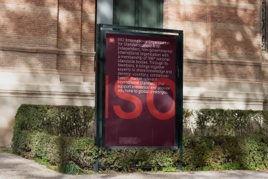
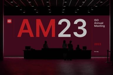
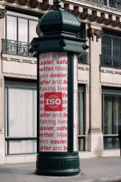
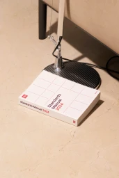
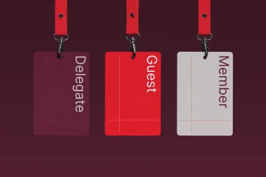
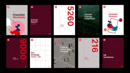
Motherbird developed a comprehensive brand identity system for ISO, establishing a modular design language that spans print, digital, and environmental applications. The project centers on a refined typographic grid system and a distinctive crimson-and-white color palette, applying a minimalist aesthetic across corporate publications, event collateral, and transit-based advertising. Technically, the execution balances crisp vector-based graphic design with 3D-rendered motion pieces. The brand system integrates structural elements like micro, meso, and macro document scaling, maintaining visual cohesion through consistent iconography and bold, high-contrast layouts. This identity is further extended into the built environment through signage and outdoor displays, utilizing natural light and high-contrast compositions to ensure legibility across diverse urban contexts.
Horizontal, Commercial, Clean, Minimalist
Brand Film / Corporate Video
