
Intermission: Brand Identity
Jun 2022
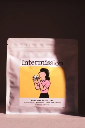
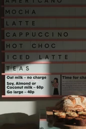
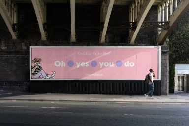
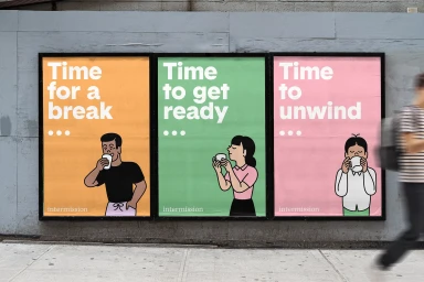
Intermission’s brand identity project establishes a visual language centered on clean, minimalist typography and expressive character illustration. Developed by Fieldwork Facility, the project spans from product packaging to large-scale outdoor advertising, utilizing a bold color palette of pink, yellow, and green to ground its graphic presence. The project integrates illustration by Tomi Um and motion design by T.R. Bennett across various mediums, including digital motion graphics and static, vector-based posters. Execution focuses on high-contrast framing and intentional use of natural light to bridge the gap between product-focused commercial work and urban-integrated displays. From cafe interior menu boards to billboard placements, the work emphasizes restrained visual communication and animated motion graphics to define the brand’s aesthetic.
Commercial, Clean, Horizontal


