
IKA: Brand Identity


Jul 2019
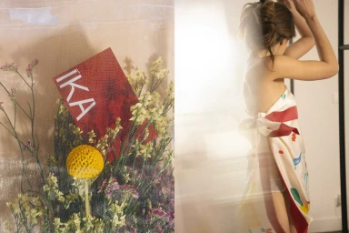
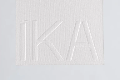
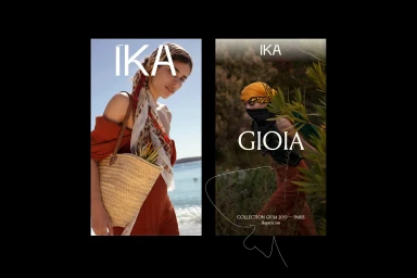
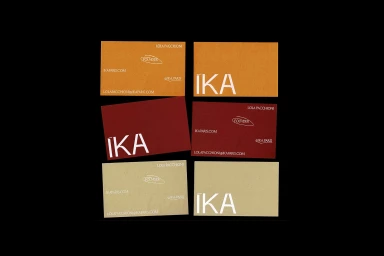
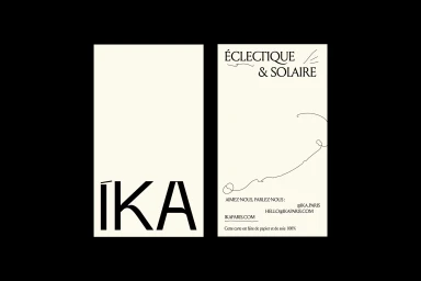
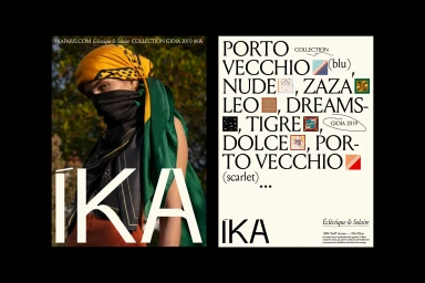
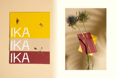
The brand identity for IKA manifests as a masterclass in editorial minimalism, seamlessly bridging the gap between high-end corporate stationery and an artisanal, lifestyle-driven aesthetic. Under the expert graphic design of Bureau Nuits, the identity relies on a restrained palette of warm ochre, deep burgundy, and neutral cream tones, grounded by a consistent, clean sans-serif typography that feels both modern and timeless. The visual language favors tactile depth, utilizing paper-like textures and sophisticated emboss and deboss techniques to transform simple contact cards and assets into premium objects. Beyond the rigid geometry of the corporate branding, the project leans into a cinematic editorial sensibility, frequently incorporating soft natural light and botanical motifs to evoke a sense of organic luxury. Whether through the crisp vector precision of a logo presentation or the ethereal, wind-swept portraits of talent draped in silk, the work maintains a cohesive, premium atmosphere. By pairing deliberate white space with rich, earthy color stories, Bureau Nuits succeeds in crafting a versatile design system that feels equally at home in a professional B2B setting or a high-fashion lifestyle campaign. The project serves as an evocative study in how subtle textures and restrained typography can elevate a brand identity into a cohesive, highly identifiable visual narrative that resonates with an artisanal audience.
Editorial, Horizontal, Clean
Typography
Advertising Campaign
