
Hut 8: Brand Identity
Oct 2025
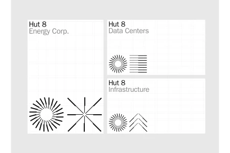
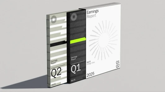
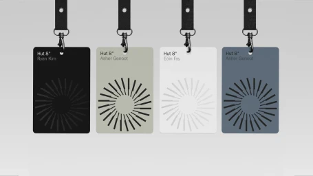
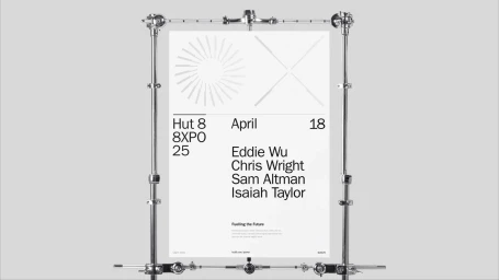
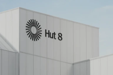
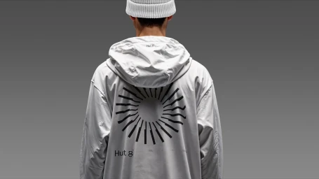
The corporate brand identity for Hut 8 establishes a unified visual language across its energy, data center, and infrastructure divisions. The system leverages minimalist typography and a suite of geometric icons, featuring radial symmetry and radiating line patterns to signal technical precision. This identity bridges digital and physical touchpoints, from clean editorial design in earnings reports to high-contrast, monochrome signage and custom apparel. The project integrates 3D-rendered hardware animations with live-action studio imagery, utilizing a neutral color palette of black, white, sage green, and slate blue. Developed with contributions from 28K in graphic design, the work emphasizes architectural clarity and a structured, industrial aesthetic suitable for the technology sector.
Commercial, Minimalist, Horizontal, Clean
Brand Film / Corporate Video
