
Hotel Glasnost
Brand Identity
Mar 2018
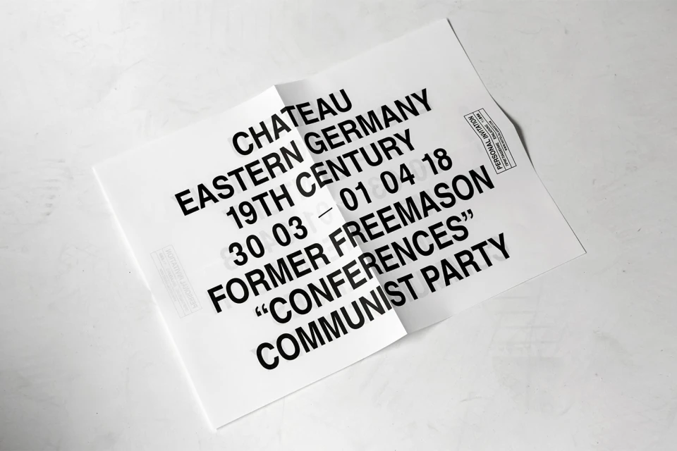
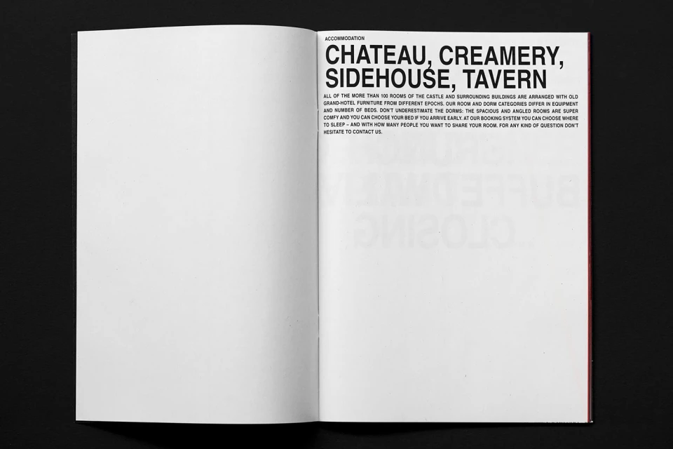
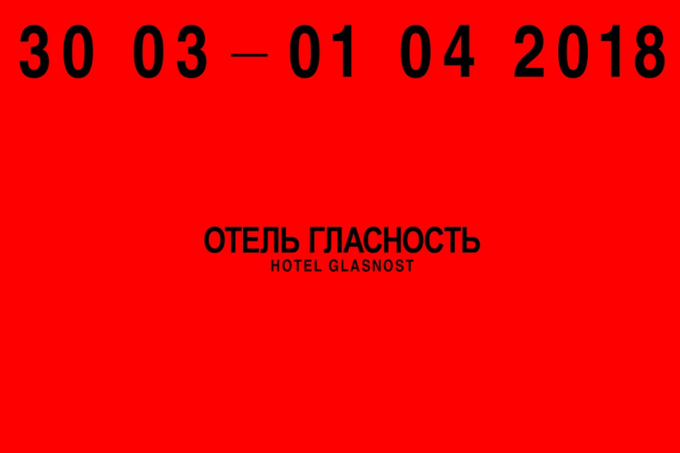
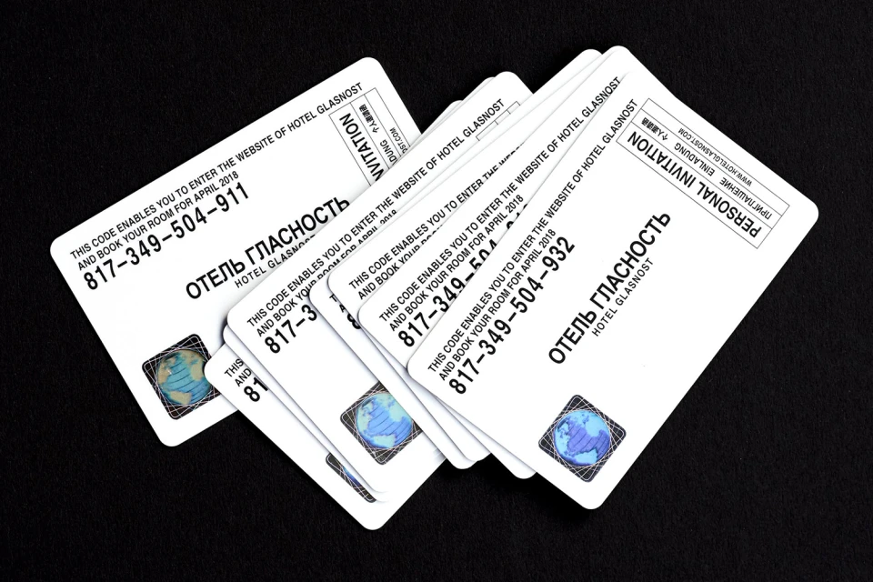
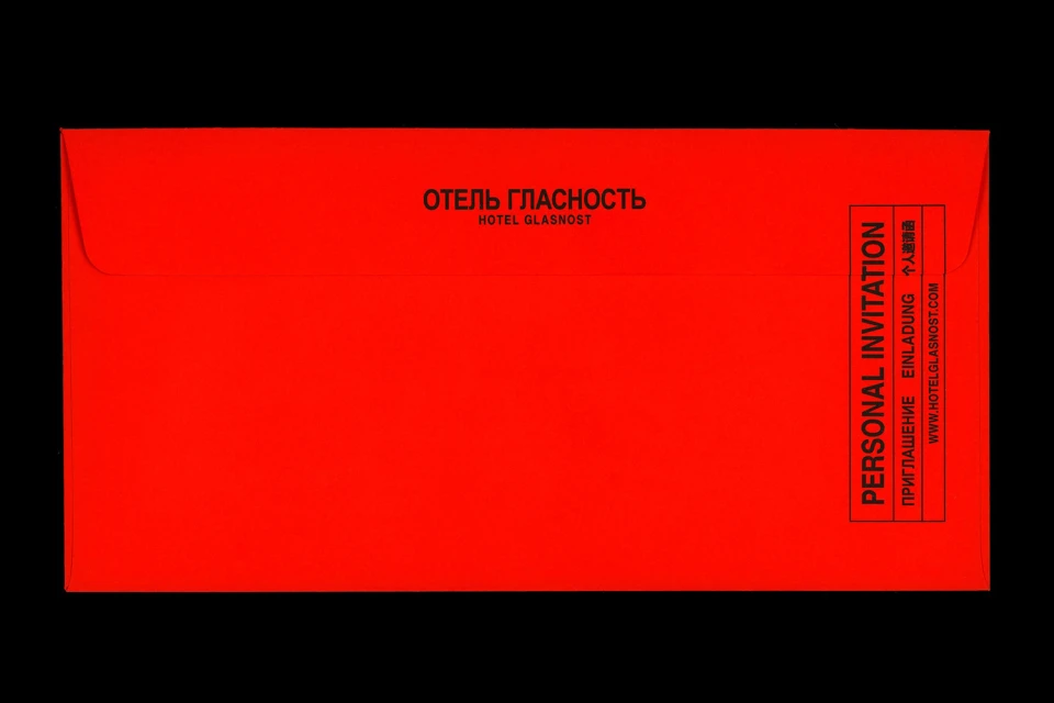
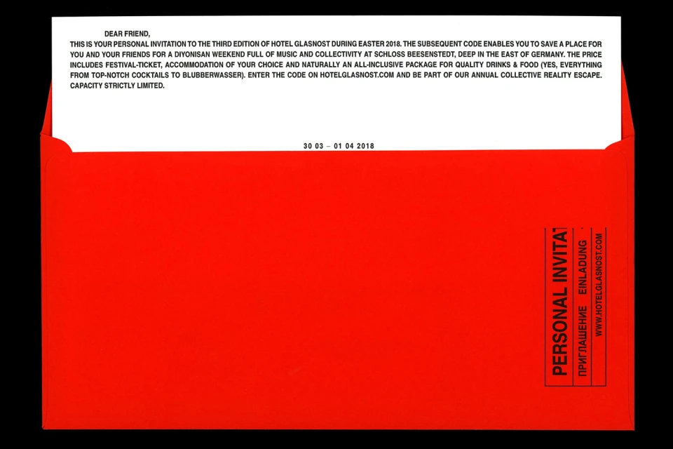
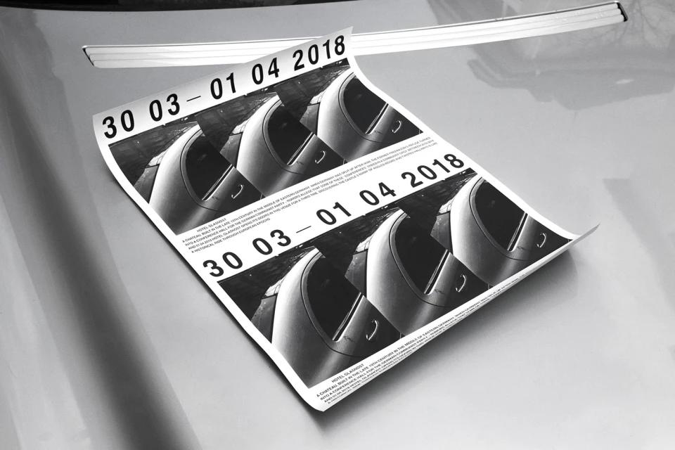
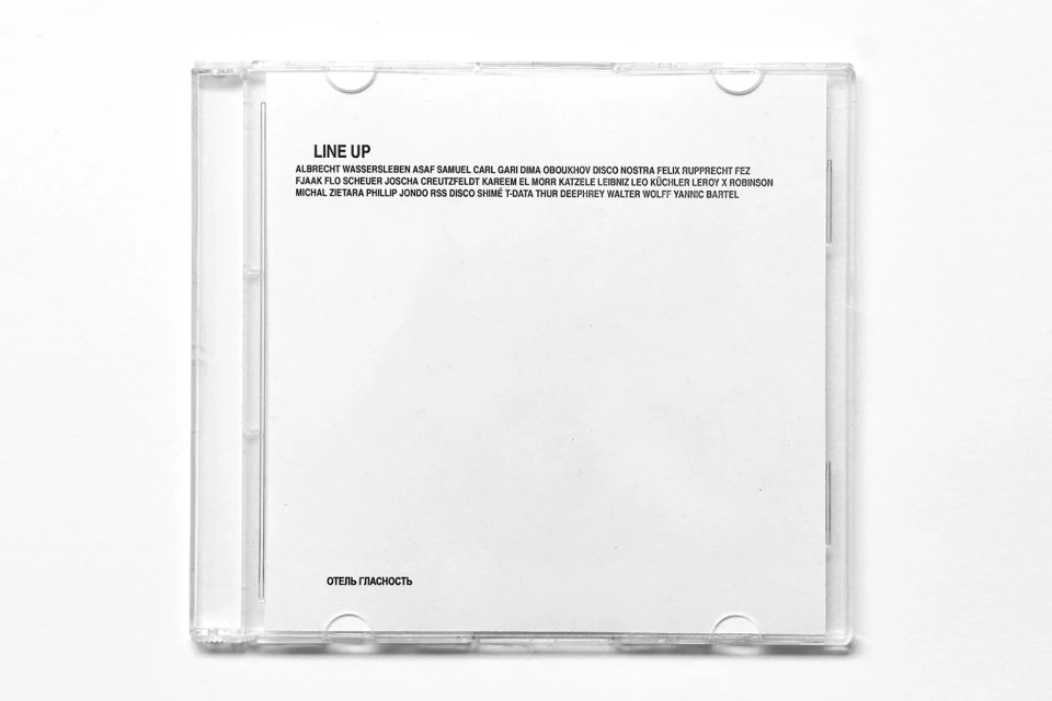
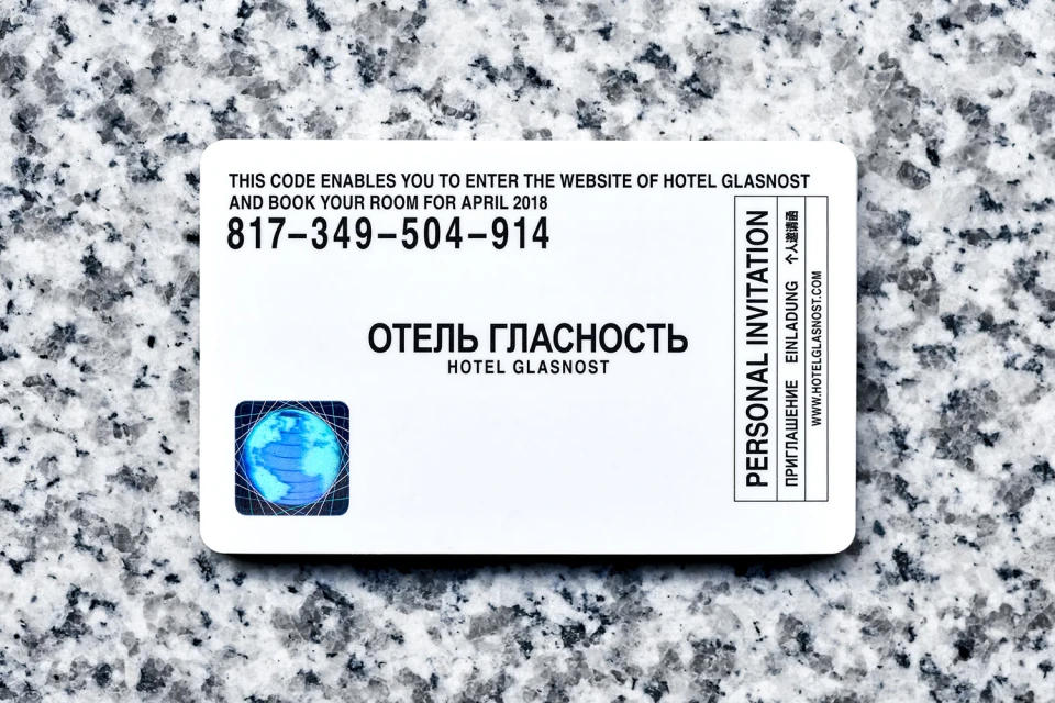
Hotel Glasnost redefines the aesthetic landscape of the hospitality industry through a striking and unapologetically rigid brand identity. By leaning into a high-contrast visual language that channels the raw, structural history of Eastern Germany, the project crafts an experience that feels both archival and contemporary. The work, executed with precision by Daily Dialogue, prioritizes clean, editorial minimalism to establish an atmosphere of exclusive, intellectual hospitality. Central to this identity is a relentless commitment to typography; the use of stark, bold sans-serif lettering—often juxtaposed against vibrant blocks of red, deep black, or pristine white—creates a modular system that flows seamlessly across diverse touchpoints. Whether applied to formal invitations, promotional posters, or bespoke collateral, the design remains consistently graphic and intentional. Utilizing cinematic lighting and controlled studio strobe techniques, each piece of print material emphasizes the tactile quality of the paper and the sharpness of the ink. By blending Cyrillic and English characters with systematic layouts, the project transcends mere branding to become a narrative piece of information design. This holistic approach transforms travel assets into collectible objects, ensuring that every booking invitation or event program reinforces a unified, international voice for the brand. Through this disciplined application of geometry and monochromatic intensity, Hotel Glasnost succeeds in building a visual world that is as thought-provoking as the historic narratives it references.
Horizontal, Clean, Minimalist, Commercial
Typography
Advertising Campaign
