
Homeward Books: Brand Identity

Sep 2025
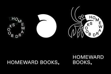
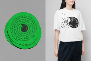
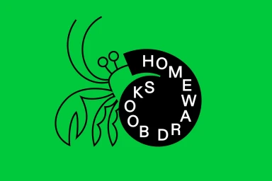
Homeward Books establishes its visual presence through a comprehensive brand identity system that prioritizes minimalist graphic design and vector-based storytelling. The identity centers on recurring motifs of hermit crabs and spiral shells, rendered in stark black-and-white linework that contrasts against vibrant, solid backgrounds. Graphic design by Emma Kaniuk & Company provides the structural framework, incorporating custom typography and manifesto-driven layouts that emphasize the brand’s focus on the written word. The project incorporates motion graphics and 3D render / CGI techniques to animate the brand's core symbols, notably through rotating metallic shell forms and fluid hermit crab illustrations. These assets are extended across physical and digital touchpoints, including printed apparel and stationary stickers, maintaining a clean, cohesive visual language. Additional contributors include illustration by Natasha Vermeulen and Ana Miminoshvili, motion design by Suz Sirunyan and Isobelle McCall, and web development by Sterling.
Horizontal, Commercial, Graphic
Vector
Solid Colour
Advertising Campaign


