
Highsnobiety: Brand Identity
Aug 2018
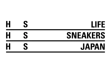
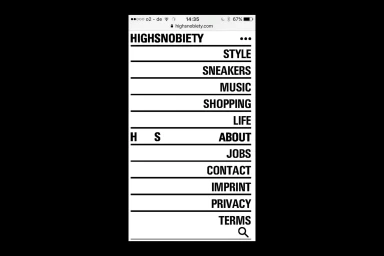
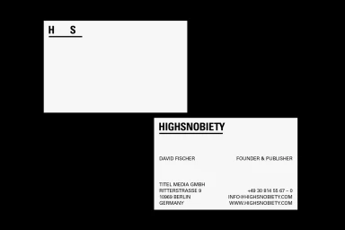
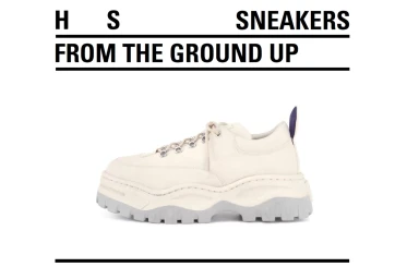
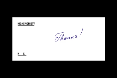
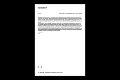
Highsnobiety has long occupied the intersection of cultural authority and digital media, and this comprehensive brand identity project serves as a masterclass in editorial minimalism. By leaning into a stark, monochromatic palette and rigorous typographic hierarchies, the design system effectively translates the platform's influence across both physical and digital touchpoints. The visual language utilizes a bold, sans-serif typeface and clean horizontal lines to impose order on a vast, fast-paced stream of content, creating a cohesive framework that feels equally at home on a mobile interface as it does on formal corporate stationery. The work, executed with the structural precision of Bureau Borsche, prioritizes clarity and high-contrast composition to elevate every piece of collateral—from business cards to specialized sneaker editorial—into a branded asset. By stripping away extraneous noise, the identity reinforces the publication's position as a curator of taste. Through the clever use of vector-based typography and a restrained layout, the system balances utility with an unmistakable corporate aesthetic, proving that modern editorial branding thrives when it embraces such intentional restraint. Every element, whether it is a minimalist UI illustration or a structured print document, adheres to a rigorous design philosophy that emphasizes the power of simplicity in an increasingly cluttered media landscape, ultimately strengthening the Highsnobiety legacy through a timeless and highly functional visual narrative.
Horizontal, Commercial, Clean, Minimalist
Typography
Advertising Campaign
