
Henua Organics: Brand Identity





Feb 2019
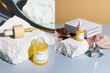
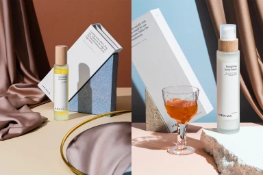
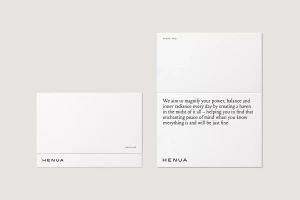
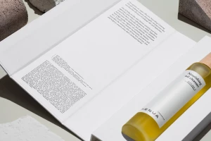
Henua Organics establishes a masterclass in modern skincare branding, leveraging a design language that sits at the intersection of raw nature and high-end clinical luxury. By weaving together sharp architectural forms and organic textures, the brand identity project projects a sense of sophisticated tranquility. The visual narrative channels a core commitment to sustainable beauty through the deliberate juxtaposition of smooth, minimalist packaging against the rugged, unpolished edges of stone and geometric blocks. This commercial photography approach uses crisp, directional natural light and soft light techniques to accentuate the tactile qualities of the products, from their wooden caps to the translucent amber hues of the nourishing oils. With meticulous graphic design from Werklig, the identity leans into editorial minimalism, utilizing clean, bold sans-serif typography that feels both grounded and aspirational. The creative execution avoids clutter, allowing the monochromatic color palette of neutral beiges and whites to elevate the product as an object of art. This comprehensive brand identity is defined by its restraint, successfully communicating a premium positioning that feels authentic, professional, and undeniably cohesive. Every element, from the deliberate staging with satin fabric to the precise framing of the dropper bottles, reinforces a promise of pure, ingredient-focused efficacy, signaling to the consumer that the brand is as much about ritual and design as it is about skincare performance.
Horizontal, Commercial, Clean, Minimalist
E-commerce / Product
