
Green Land: Brand Identity

Aug 2023
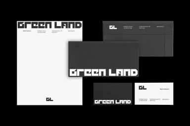
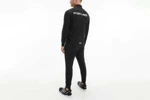
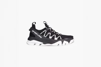
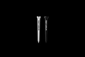
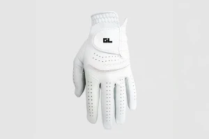
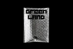
The brand identity for Green Land, developed by design studio Plus Minus, establishes a cohesive corporate visual language centered on high-contrast, monochromatic aesthetics. The project bridges professional stationery suites and apparel, utilizing a custom geometric typeface that anchors both print collateral and merchandise. Execution leans into a minimalist approach, featuring the brand's monogram and logotype across a variety of applications, from textured envelopes to athletic wear. The identity system is defined by its clean, sharp lines and vector-based precision, ensuring consistency across disparate product categories such as golf accessories and specialized packaging. The visual output relies on a stark black and white palette to maintain a professional rhythm throughout the brand's touchpoints.
Horizontal, Commercial, Clean, Minimalist
Black Seamless
