
GJØA (Sporting Club GJØA): Brand Identity
Jan 2026
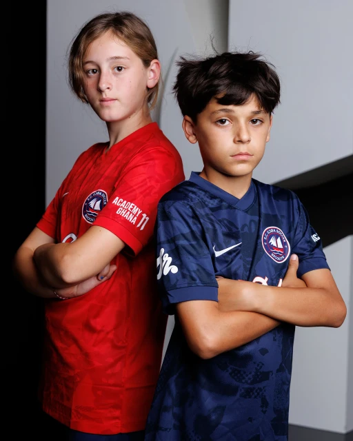
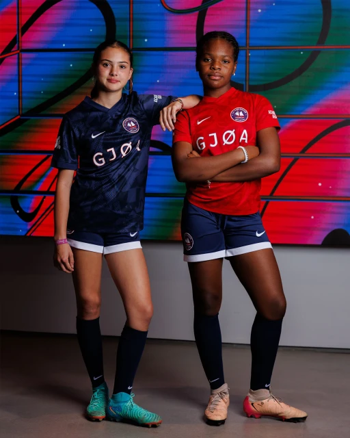
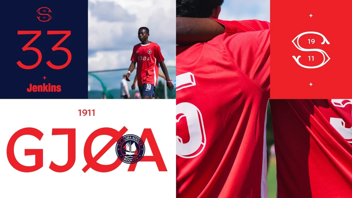
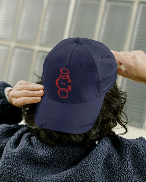
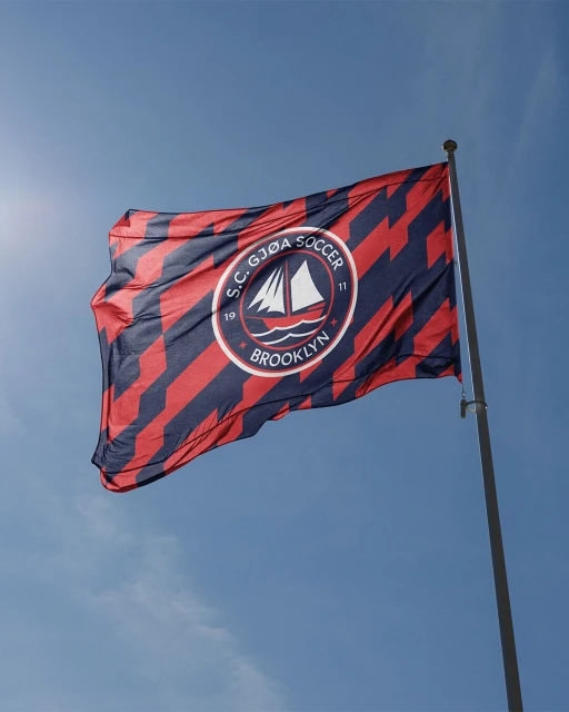
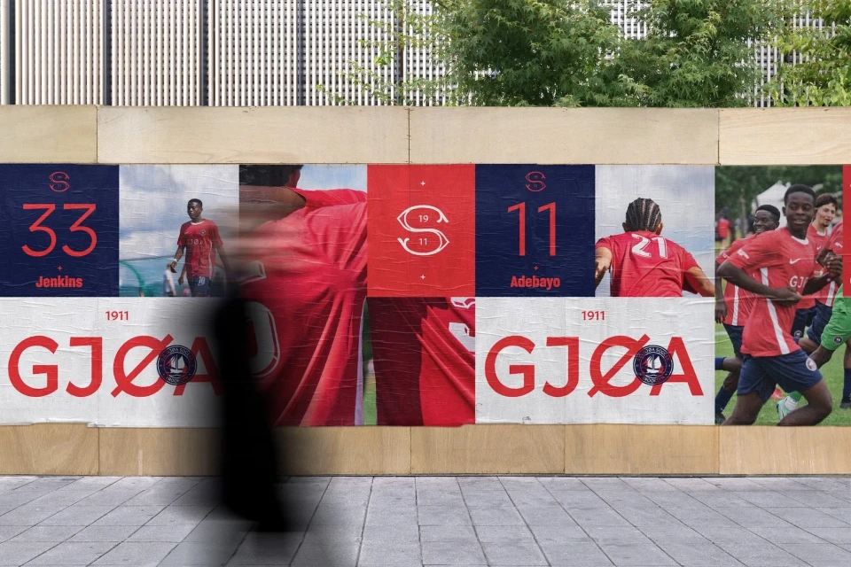
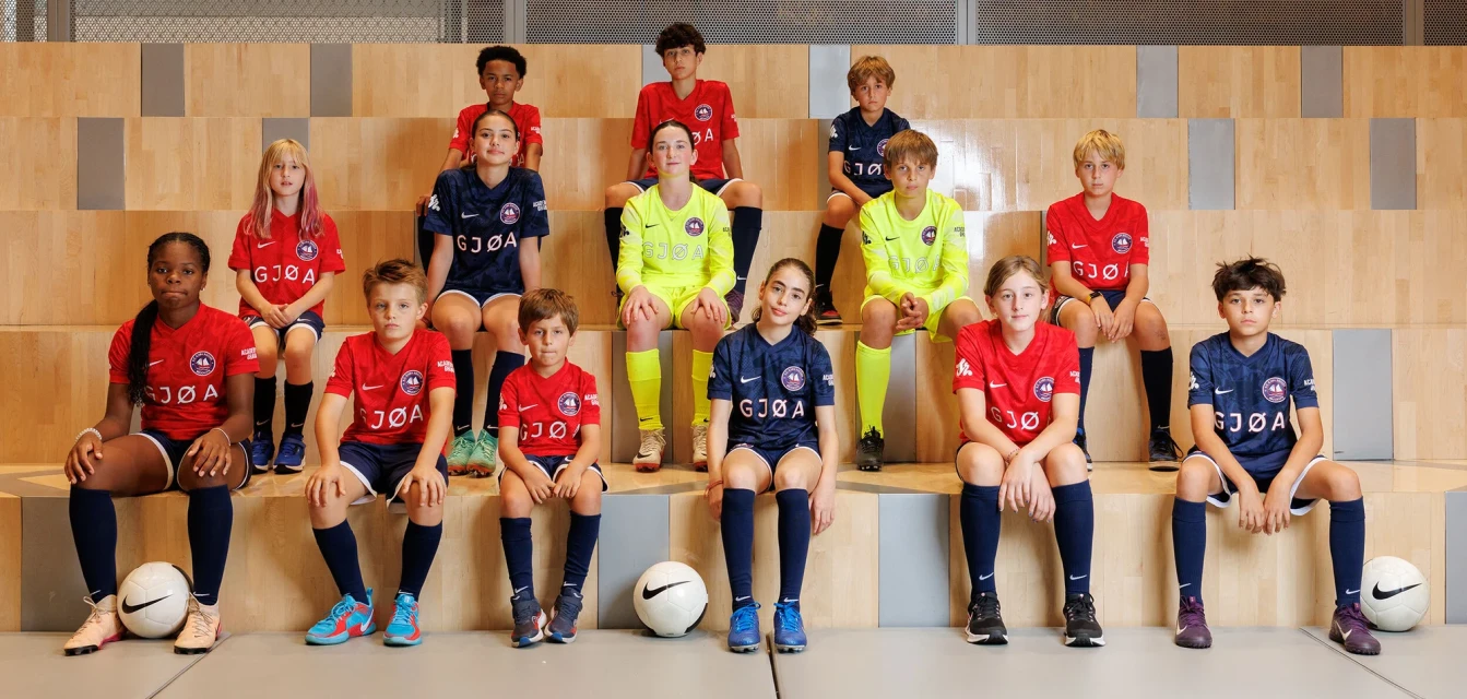
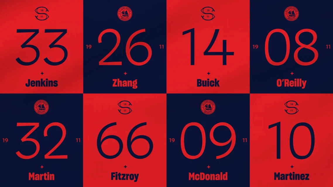
Sporting Club GJØA, the oldest Norwegian-American soccer club, receives a comprehensive brand identity refresh that bridges its 1911 heritage with a modern athletic aesthetic. Developed by Athletics for design and North Sea Air for photography, the project utilizes a high-contrast palette of red, navy blue, and white to unify the club's visual presence. The identity system spans across print, digital, and environmental applications. The creative execution integrates archival team portraits and documentary-style sketches with contemporary, clean-lit action photography. Technical highlights include rhythmic motion graphics, precise vector-based typographic layouts, and natural light-focused portraiture that emphasize the club's community roots.
Commercial, Clean, Horizontal
Soccer
Advertising Campaign

