
Girls Who Code: Brand Identity
Feb 2023
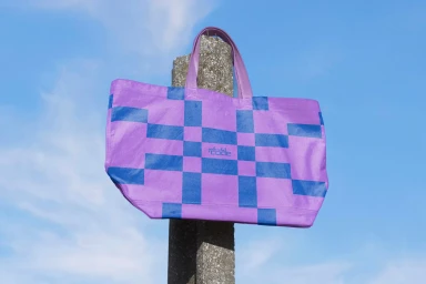
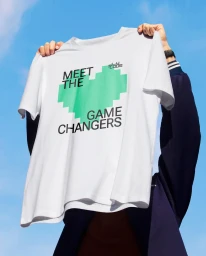
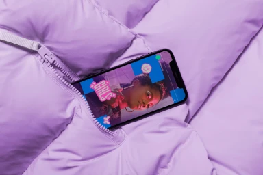
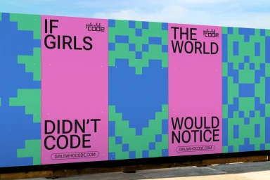
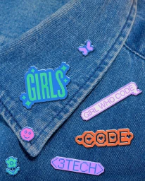
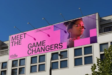
The brand identity project for Girls Who Code, executed by Mojo Supermarket, establishes a vibrant visual language that bridges digital aesthetics with tactile, real-world applications. The design system leverages a high-contrast palette of hot pink, royal blue, and bright green, utilizing 1980s-inspired pixel art and geometric patterns to create a modern, energetic presence across multiple touchpoints. From large-scale urban billboards and outdoor advertising to integrated merchandise like apparel, enamel pins, and accessories, the identity is applied with a focus on clean, bold typography. The visual assets employ natural light to emphasize texture and color, while motion graphics and animation further animate the brand's core messaging, effectively blending retro digital motifs with contemporary design.
Horizontal, Commercial, Clean
