Freigeist: Brand Identity
May 2020
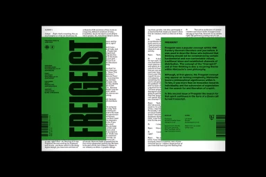
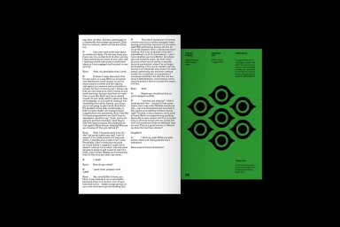
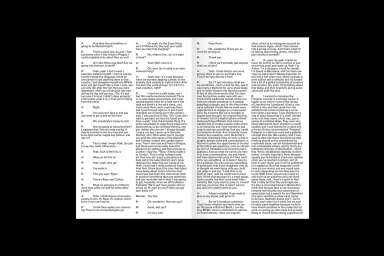
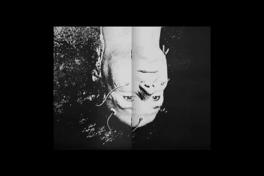
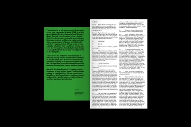
The brand identity for Freigeist serves as a masterclass in editorial design, positioning the publication at the intersection of digital media and print culture. By prioritizing typography as the primary visual engine, the project achieves a sophisticated, academic aesthetic that feels both functional and avant-garde. The execution leans heavily into a high-contrast palette, utilizing a recurring, saturated green block that cuts through dense, column-based transcripts. This deliberate choice creates a rhythmic tension between the heavy, information-rich text and the stark, structured negative space. Through the expertise of LogoArchive, the project successfully bridges the gap between commercial layout and artistic expression, employing techniques like low-key chiaroscuro lighting and cinematic framing to elevate static printed pages into a compelling visual narrative. The zine utilizes a minimalist sans-serif approach that ensures readability while allowing abstract, geometric motifs to disrupt the formality of the interview format. By combining high-contrast layouts with subtle grain textures that evoke a film-like quality, the identity feels tactile and intentional. This project stands out for its commitment to editorial minimalism, proving that when typography is treated with such precision, the layout itself becomes the story. Ultimately, the work succeeds as a cohesive brand system, balancing the complexities of modern conversation with the timeless, disciplined structure of traditional print design.
Editorial, Horizontal, Clean, Minimalist
Typography, Screen print / silkscreen
Editorial