
Formagenda: Brand Identity
Jun 2022
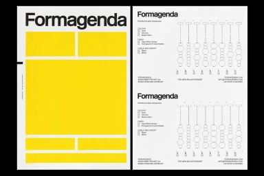
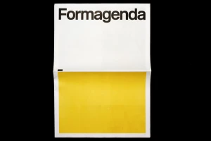
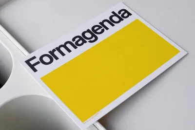
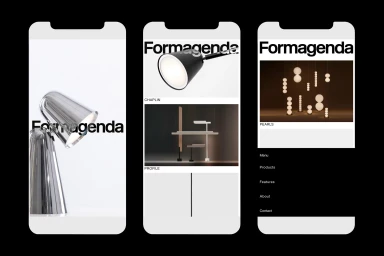
Formagenda commissioned Wiegand von Hartmann to develop a comprehensive brand identity that centers on precision and minimalist graphic design. The project establishes a visual language defined by structured grid alignments, bold sans-serif typography, and a signature yellow color palette that punctuates otherwise neutral compositions. Extending across both print and digital touchpoints, the identity encompasses product specification layouts, business collateral, and a cohesive web interface. The digital execution integrates motion graphics to showcase an architectural lighting catalog, maintaining a clean, technical aesthetic that prioritizes clarity and formal geometry throughout its presentation.
Commercial, Clean, Minimalist, Horizontal
Typography
White Seamless
Website / Web
