
Eastbourne Town FC
Brand Identity



May 2017
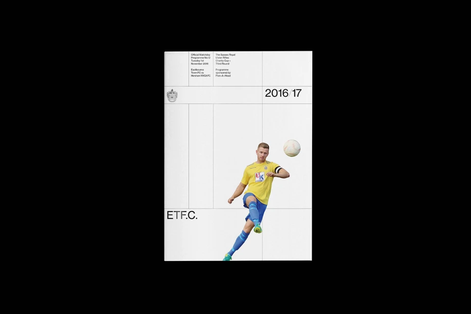
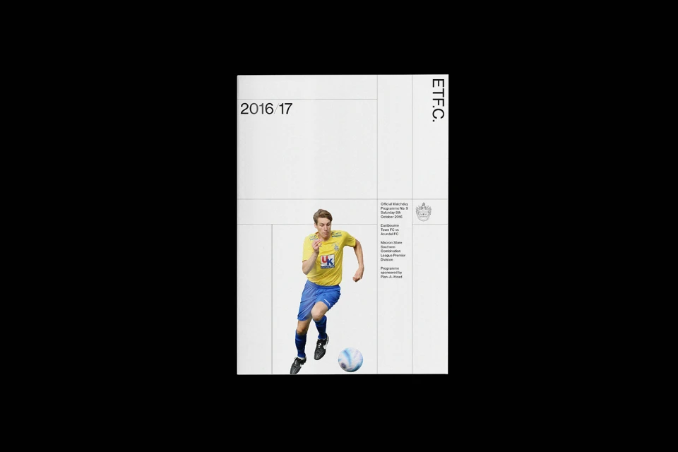
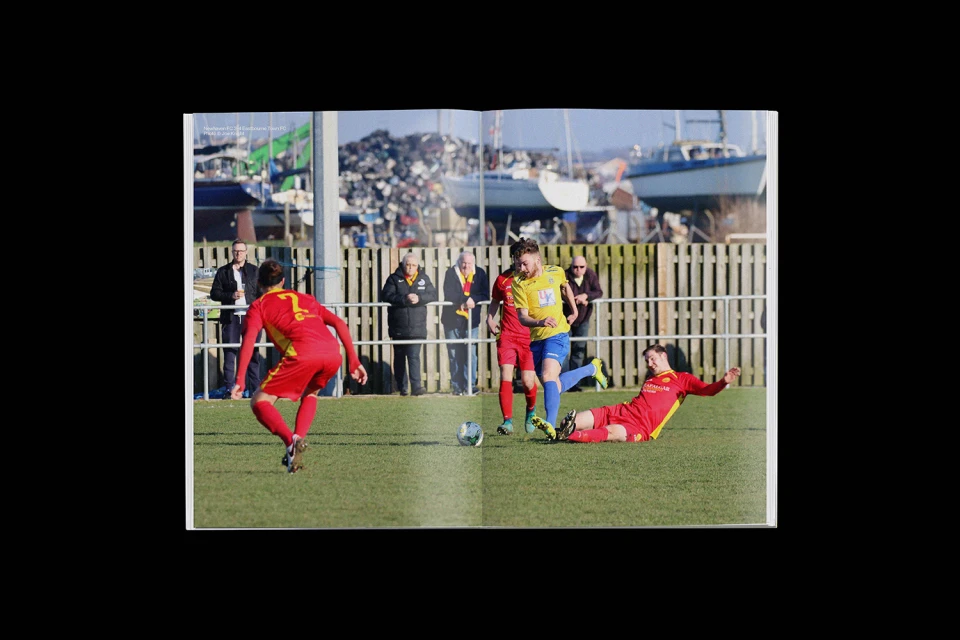
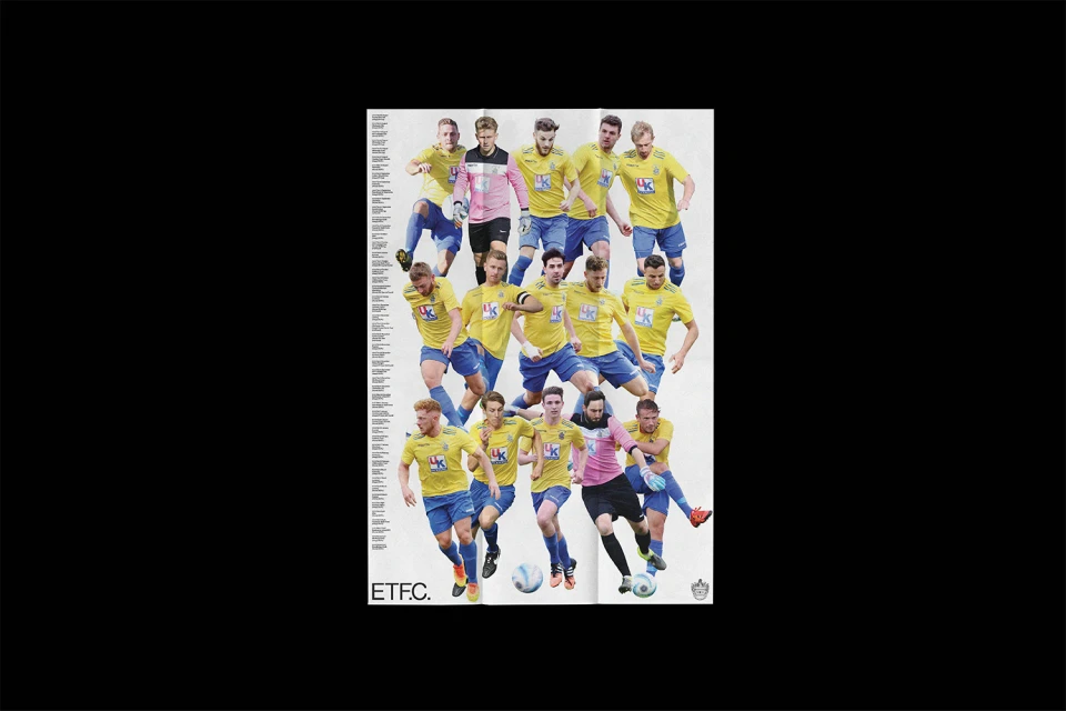
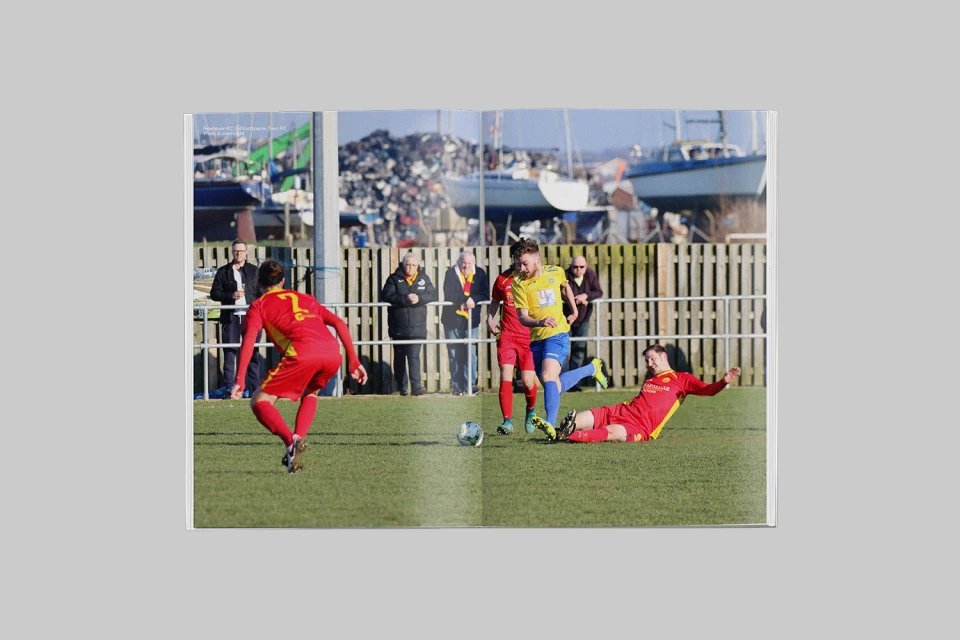
The brand identity overhaul for Eastbourne Town FC serves as a masterclass in modern sports branding, stripping away the traditional clutter of club visuals in favor of a clinical, information-forward aesthetic. Led by the precise graphic design work of Alex Brown, the project redefines the team's visual language through a lens of corporate minimalism and strict structural discipline. By leveraging a high-contrast palette and a rigid grid system, the identity establishes a sense of professional permanence that feels both contemporary and deeply rooted in the club's heritage. The use of vector illustrations—most notably the refined heraldic crest featuring the iconic seahorse—demonstrates a commitment to versatility, allowing the brand to pivot seamlessly between stark, monochromatic digital applications and tactile, editorial print materials like matchday programmes. The identity leans into a clean, sans-serif typography suite that anchors the more dynamic elements of the design, such as the layered collages of athletes in motion and technical isometric stadium diagrams. Whether applied to merchandising like minimalist cotton totes or captured through the lens of reportage photography during live action, the branding maintains a cohesive, premium feel. This rigorous, systematic approach to design elevates the club's identity, transforming everyday assets into a polished, unified ecosystem that prioritizes clarity, functionality, and a sharp, modern sports sensibility.
Horizontal, Minimalist
Typography
Soccer
