
David William Baum: Brand Identity
Jan 2020
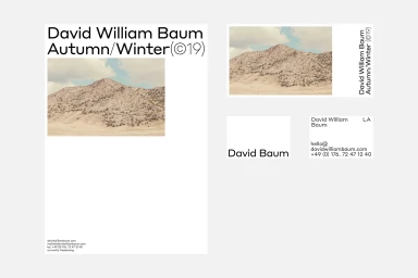
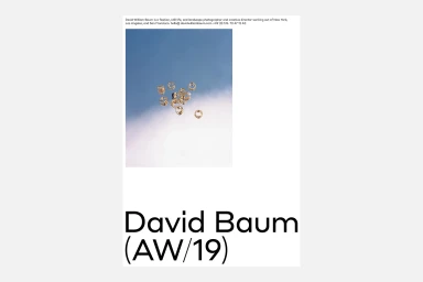
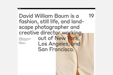
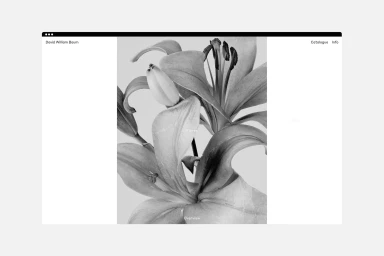
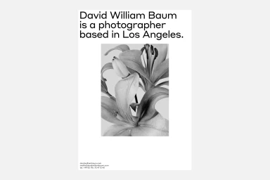
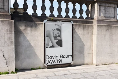
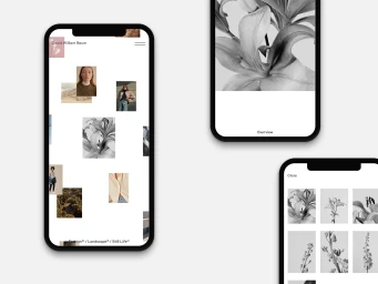
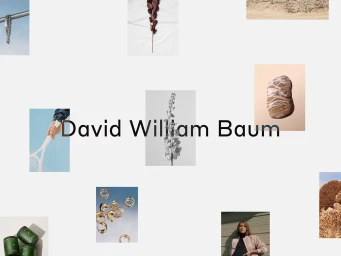
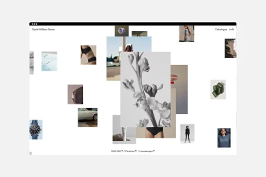
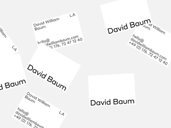
The brand identity for Los Angeles-based photographer David William Baum captures a sophisticated intersection of organic texture and clinical digital precision. Developed with graphic design expertise from Ben Mingo, the project functions as an expansive visual system that seamlessly bridges fashion, still life, and landscape photography. The design language leans into editorial minimalism, utilizing a clean monochromatic palette and deliberate negative space to ground the work in a contemporary, high-end commercial context. Typography plays a pivotal role throughout the identity, where the interplay of structured serif and bold sans-serif fonts provides a rigid, professional framework for an otherwise fluid body of work. The execution relies on a modular UI illustration approach, evident across both web interfaces and mobile grids, which curate diverse imagery—ranging from delicate botanical studies to gritty urban landscape photography—into a cohesive digital portfolio. By integrating elements like high-contrast lily portraits and tactile jewelry shots with the raw, atmospheric photography of the AW/19 collection, the branding establishes a clear, confident narrative. Whether applied to outdoor advertising displays or tactile business card layouts, the project maintains a consistent, understated visual logic. This is not merely a logo, but a flexible architecture that highlights the photographer’s versatility while maintaining an elegant, artistic tension between the natural world and modern industrial design.
Horizontal, Clean, Minimalist
Typography
White Seamless
Website / Web
