
David Hillier
Brand Identity
Mar 2018
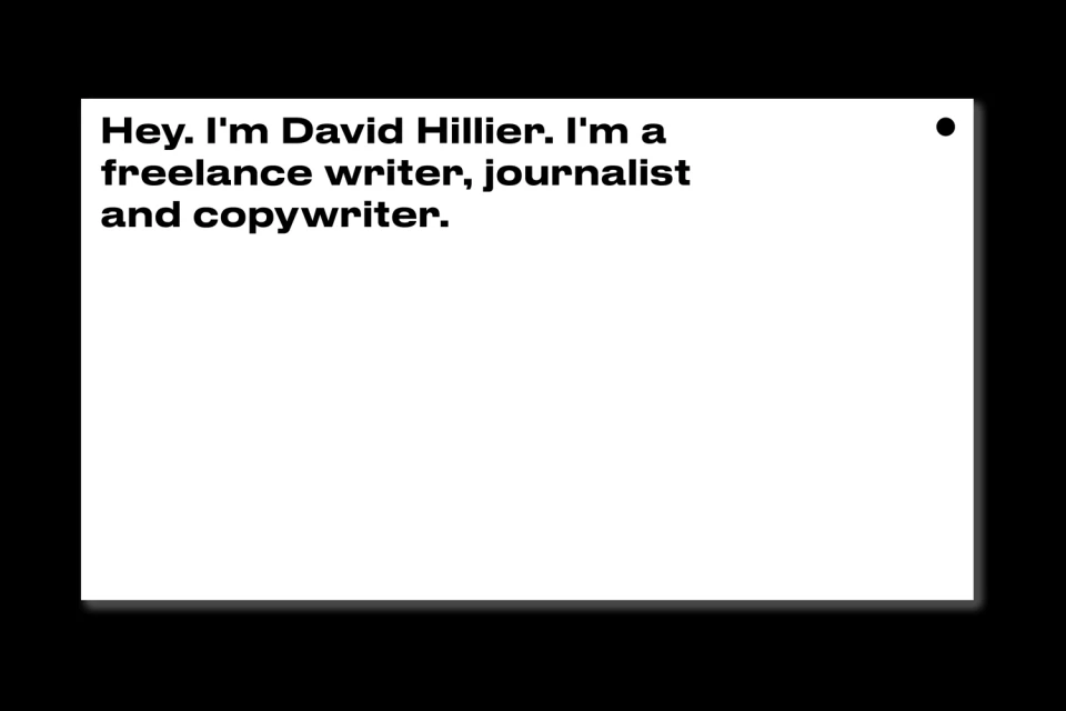
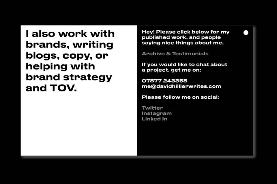
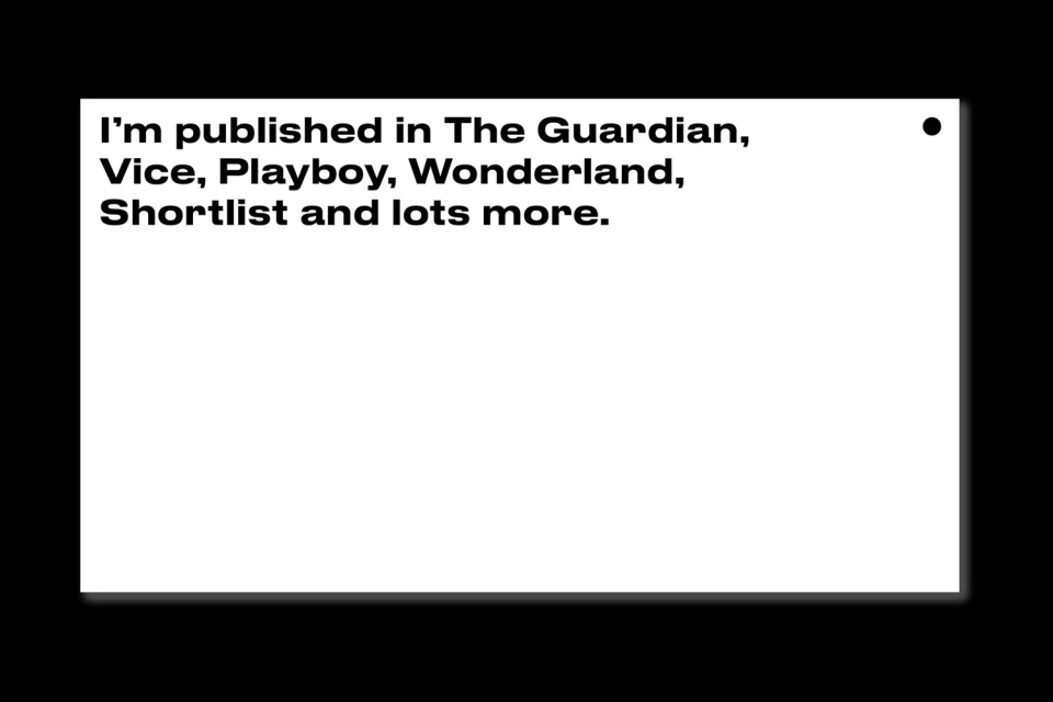
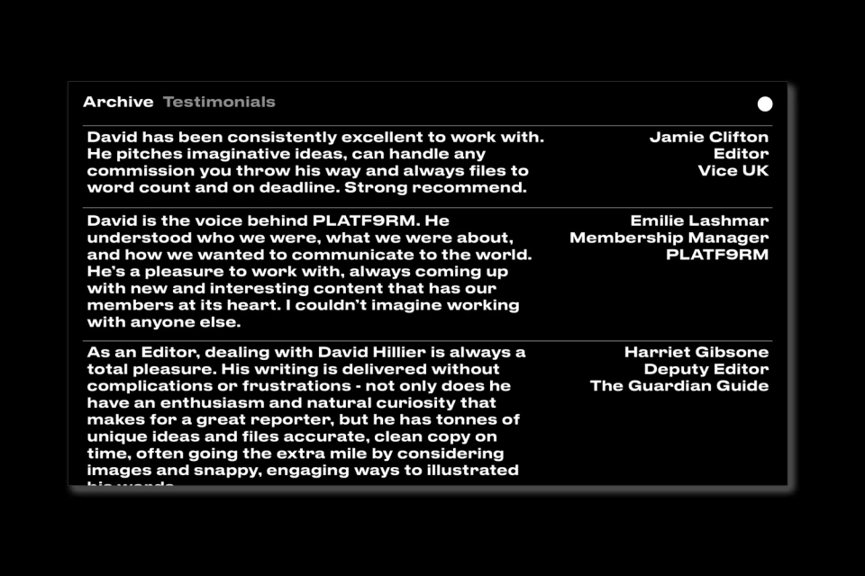
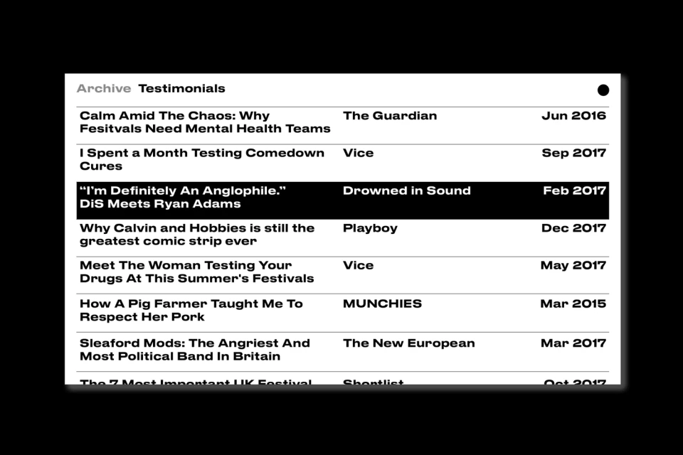
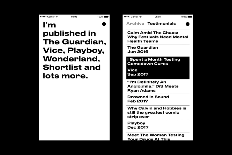
In the fast-paced world of Digital Media and Publishers, a freelance journalist’s personal brand needs to command attention without clutter. The recent brand identity project for David Hillier accomplishes this through a masterclass in editorial minimalism. Developed with precision by Myles Lucas Studio, the visual language relies on a stark high-contrast color palette, utilizing black and white to create a professional and authoritative presence. The design centers on clean, bold sans-serif typography that ensures legibility while positioning Hillier as a serious, well-established voice in the industry. By leaning into negative space and a structured grid, the identity effectively communicates credibility, showcasing a client roster that includes heavyweights like The Guardian, Vice, and Playboy. Whether through a static card-based layout or a sleek mobile UI illustration, the aesthetic remains consistent and intentionally restrained. The project avoids unnecessary ornamentation, instead focusing on the clarity of professional data and testimonials. This vector-based approach serves as an excellent case study in how corporate identity can translate across diverse digital touchpoints. By stripping away visual noise, the branding highlights the journalist's ability to handle complex commissions and imaginative pitches, ultimately translating the simplicity of the design into a powerful, professional signal that resonates with potential collaborators and media partners across the global landscape.
Commercial, Clean, Horizontal, Minimalist
Typography
Black Seamless
Website / Web
