
Beatrice Larkin
Brand Identity
Apr 2018
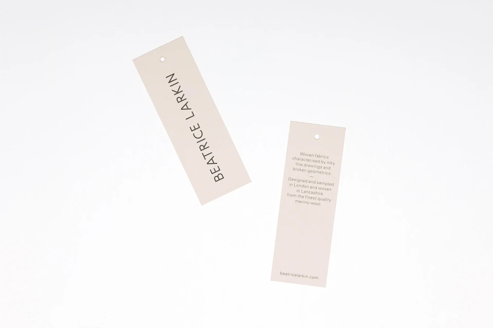
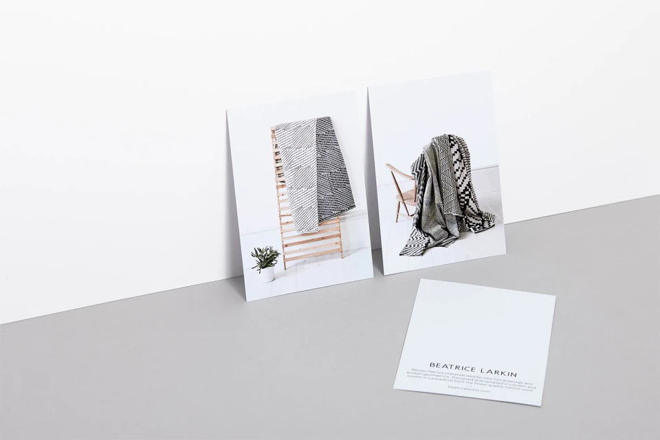
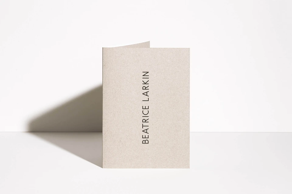
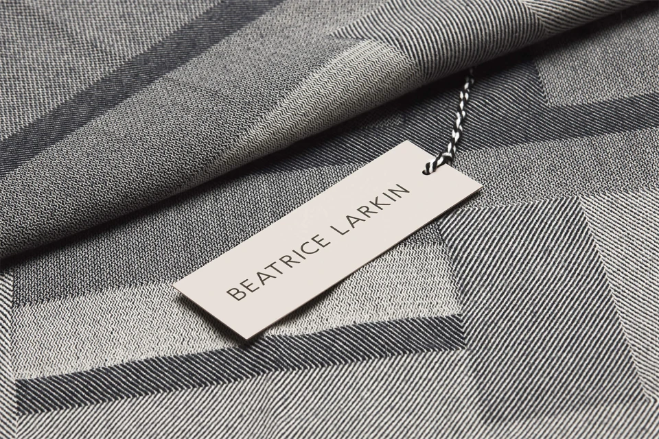
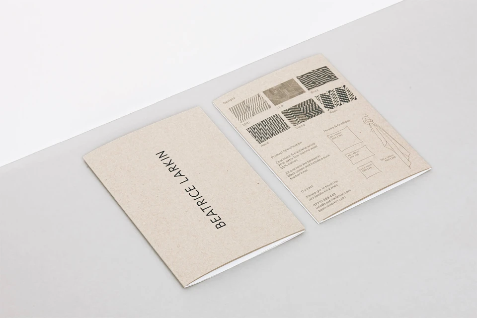
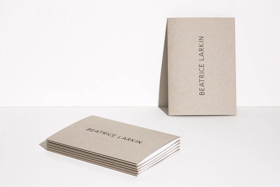
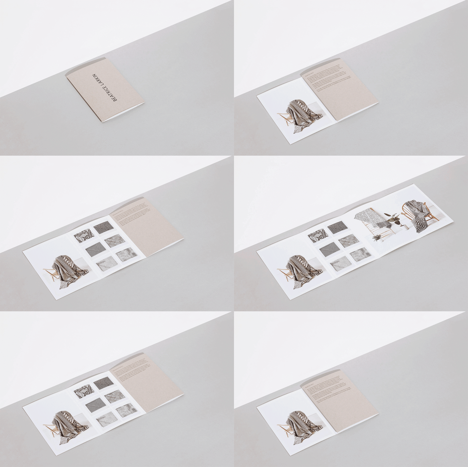
In the world of luxury textiles, brand identity must serve as a physical extension of the product quality itself, and the new visual identity for Beatrice Larkin achieves this with striking precision. Moving beyond traditional stationery, this project delivers a comprehensive design language that leans into editorial minimalism to reflect the intricate geometric patterns found within the brand’s woven fabric collections. Executed with the sharp, deliberate aesthetic of Myles Lucas Studio, the identity employs a disciplined palette of beige, black, and white, prioritizing structural clarity and tactile depth. The visual system leverages high-key lighting and studio strobe techniques to accentuate the textured paper stock, bridging the gap between corporate collateral and artisanal textile design. Through a series of clean, macro-focused product tags and balanced layout compositions, the identity emphasizes the marriage of graphic rigor and textile craft. By utilizing a clean, sans-serif typeface, the branding strips away unnecessary ornamentation, allowing the complexity of the brand’s signature patterns—seen in the folded throws and interior lifestyle snapshots—to stand as the primary narrative. This project succeeds by treating every touchpoint, from the business card to the product label, as an essential element of the luxury experience. The resulting output is a masterclass in professional typography and structured information design, perfectly capturing the sophisticated, design-forward spirit inherent to the bags and accessories sector.
Horizontal, Commercial, Clean, Minimalist
Typography
