
DATEAGLE ART: Brand Identity


Aug 2018
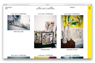
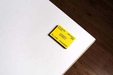
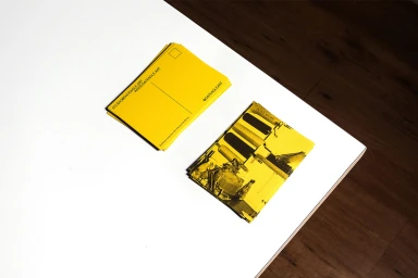
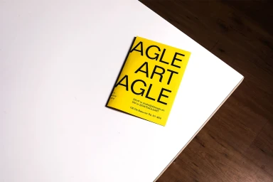
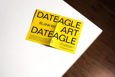
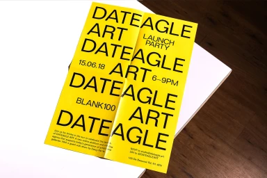
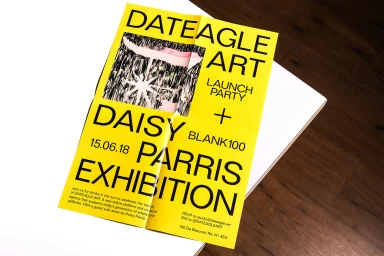
The brand identity for DATEAGLE ART masterfully distills the complex world of contemporary fine art into a highly structured, minimalist digital and physical ecosystem. Executed by the team at All Purpose, the project establishes a cohesive visual language that leans into editorial minimalism and professional clarity, serving both the needs of a digital media publisher and an art agency. The core design language relies on a striking high-contrast palette of vibrant yellow paired with bold, sans-serif typography, creating a signature aesthetic that bridges the gap between digital content and physical collateral. From the interface design of the interview archive to the tactile precision of the stationery, the work emphasizes a rigorous typographic hierarchy that prioritizes information flow and readability. The project uses soft light and crisp studio compositions to elevate everyday promotional flyers and business cards into essential artifacts of the brand's culture. By maintaining this consistent geometric form across both UI illustration and printed materials, the team has successfully cultivated a professional, recognizable identity that feels both modern and deeply rooted in the art world. This exercise in corporate design proves that when restraint meets a high-impact color scheme, the result is a functional, memorable brand identity that stands out within the competitive landscape of media and entertainment.
Horizontal, Commercial, Clean
Typography
Wood Texture
Website / Web, Advertising Campaign
