
Crucible: Brand Identity

Aug 2024
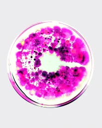
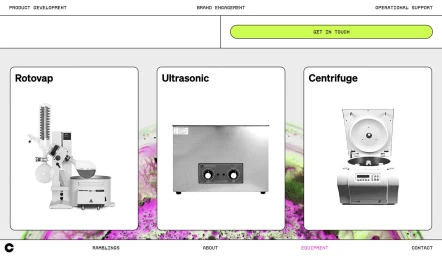
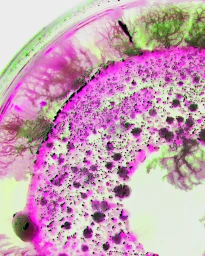
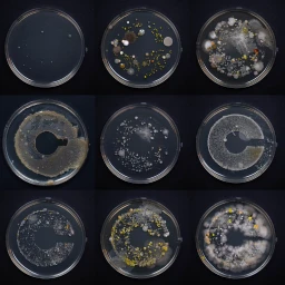
Crucible’s brand identity project centers on a scientific and clinical visual language, executed through a series of graphic and motion assets. The work incorporates vibrant magenta and neon green organic patterns, which are juxtaposed against minimalist, light grey backgrounds to maintain a controlled aesthetic. Madalena Studio led the graphic design, utilizing macro photography and 3D render/CGI techniques to document microbial growth. The project utilizes a consistent visual metaphor of circular petri dishes to explore cellular development, culminating in compositions that feature biological cultures arranged into the brand's signature initial. The overall identity bridges artistic experimentation with structured UI illustration and clean motion graphics.
Minimalist, Clean
Advertising Campaign
