
Creative Loop: Brand Identity



Jun 2019
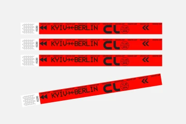
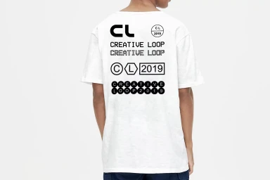
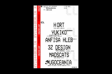
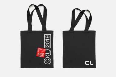
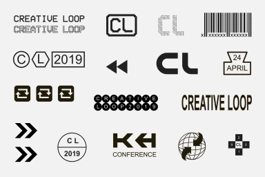
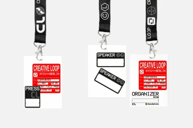
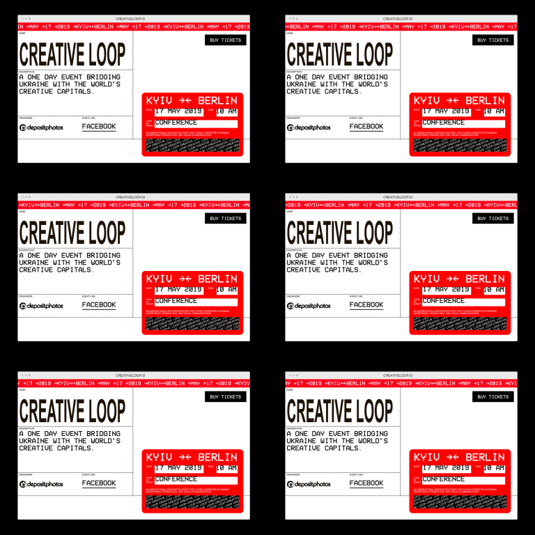
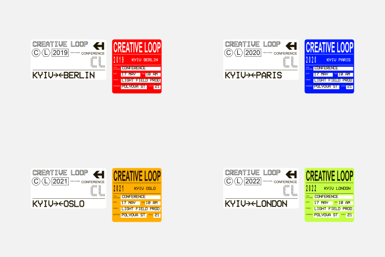
The brand identity for Creative Loop transcends traditional event collateral, positioning itself as a robust, data-driven visual system that bridges the creative communities of Kyiv and Berlin. Developed by the design studio CREVV, the project utilizes a high-contrast palette of stark white, jet black, and vibrant red to establish an aesthetic that feels both industrial and distinctly modern. By leaning into a minimalist design language, the branding effectively incorporates heavy, pixelated sans-serif typography and technical numerical strings to create a cohesive information hierarchy. This functional approach is articulated through a variety of commercial assets, ranging from tactile promotional items like branded wristbands and canvas totes to large-scale urban poster installations that serve to anchor the identity in a physical space. The use of natural light and clean studio compositions emphasizes the versatility of the vector-based iconography, which shifts seamlessly between physical conference badges and digital web interfaces. Ultimately, the identity channels a professional, yet raw, editorial minimalism that reflects the fast-paced nature of a contemporary design conference. Whether showcased through live-action documentary shots of speakers or flat-lay product photography, the Creative Loop brand identity remains remarkably consistent, proving that a disciplined application of layout and typeface can unify complex event logistics into a singular, compelling visual narrative.
Horizontal, Commercial, Clean
Typography, Vector
White Seamless
