
CÎME
Brand Identity


Mar 2026
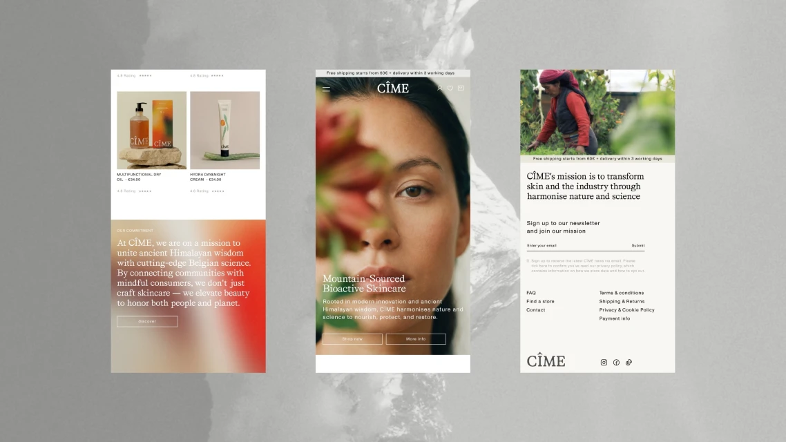
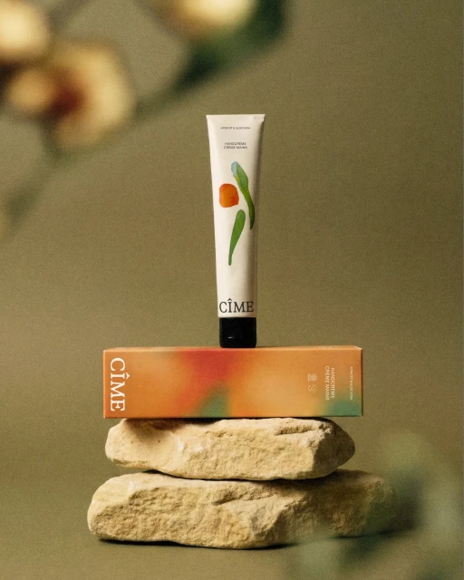
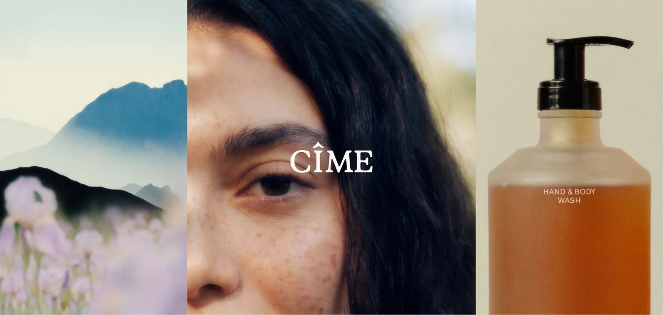
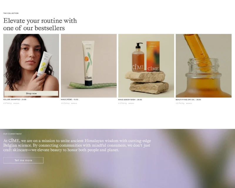
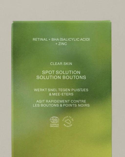
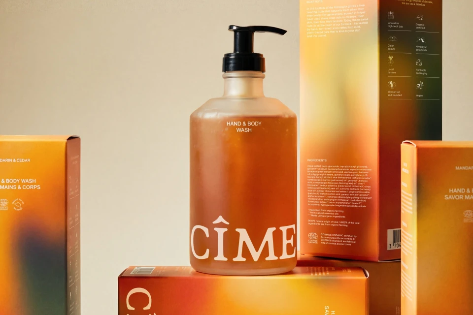
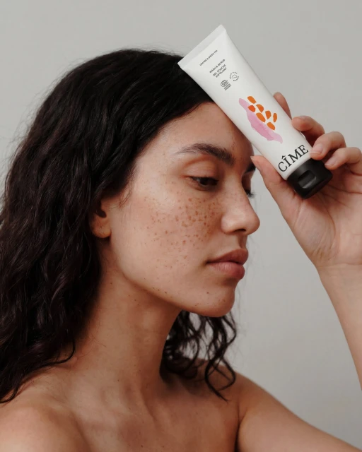
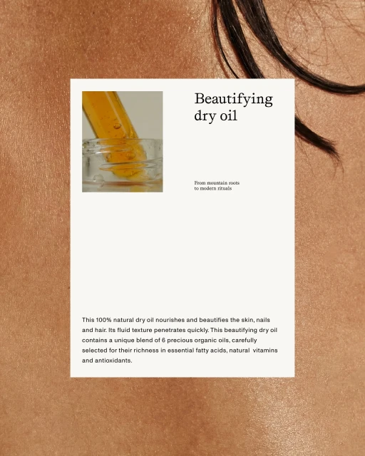
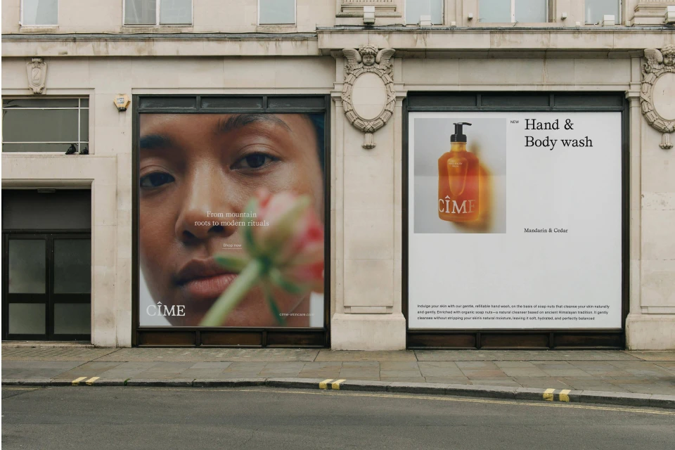
The brand identity for CÎME captures the essence of modern skincare by synthesizing organic roots with a sophisticated, minimalist aesthetic. Through a refined visual language, the project elevates the beauty industry standard, leaning into editorial minimalism to emphasize both product efficacy and natural ingredients. The design framework, crafted with art direction from The Phoney Club and precision web development by dear digital, ensures a seamless transition between digital UI illustration and physical retail presence. Visual storytelling across the brand's campaign relies on studio strobe lighting and macro photography to highlight textures, from the golden hues of its oils to the raw, stone-like elements that ground the packaging in nature. Images produced by The Phoney Edit reinforce this connection, utilizing live-action technique and candid, natural-light portraits to celebrate authentic skin texture. By marrying clean typography with an earthy color palette of muted olives and vibrant warm gradients, the identity creates a cohesive narrative that speaks to the brand's Belgian, organic-certified heritage. The result is a highly polished, professional brand ecosystem that feels both approachable and premium, successfully anchoring CÎME as a forward-thinking player in the competitive skincare market while maintaining a human-centric approach to beauty that resonates across both digital platforms and physical environments.
Commercial, Clean, Vertical
Skincare


