Cat Person: Brand Identity
May 2020
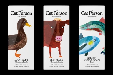
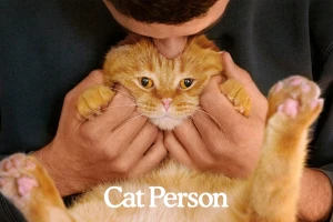
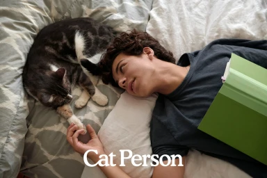
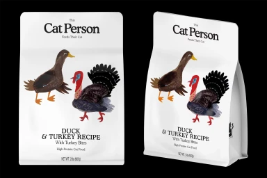
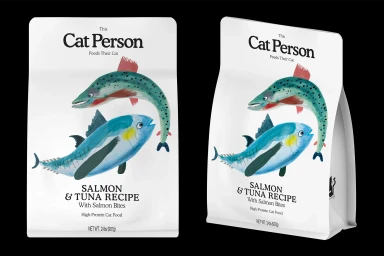
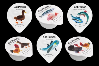
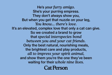
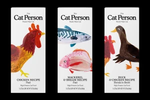
In the crowded landscape of the CPG sector, Cat Person carves out a distinct niche by elevating pet care through a sophisticated yet playful brand identity. This comprehensive creative project masterfully balances the functional requirements of food and beverage packaging with an emotive, human-centric storytelling approach. Central to the brand’s visual language is the elegant use of negative space, which allows the whimsical, hand-painted watercolour illustrations by Paul Davis to take center stage against stark, high-contrast black backgrounds. Mythology has successfully anchored the identity in a clean, editorial minimalism, utilizing a classic serif typeface that bridges the gap between premium design and accessible, everyday utility. Beyond the product line, the brand’s soul is captured through lifestyle photography by David Robert Elliott. His use of natural light and soft, intimate compositions effectively channels the quiet, tactile connection between humans and their feline companions, grounding the commercial elements in authentic warmth. By seamlessly integrating these artistic flourishes—ranging from vector-based typographic layouts to expressive, organic art—the project creates a cohesive aesthetic that feels both modern and deeply personal. It is a masterclass in how purposeful design and thoughtful art direction can transform standard pet food into a lifestyle-focused experience that honors the genuine bond shared between a cat and its person.
Commercial, Clean, Horizontal
Advertising Campaign