
Cartesia
Brand Identity




Nov 2024
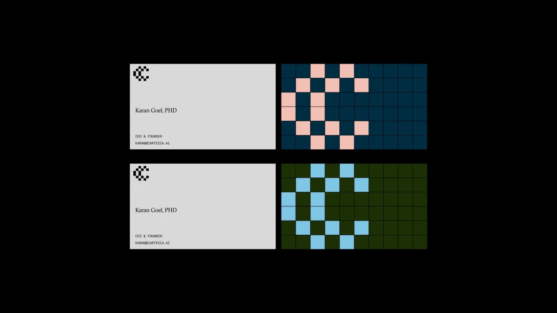
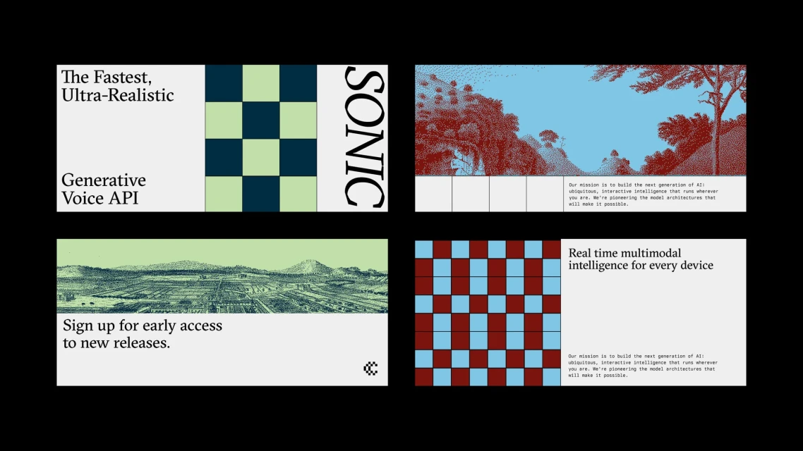
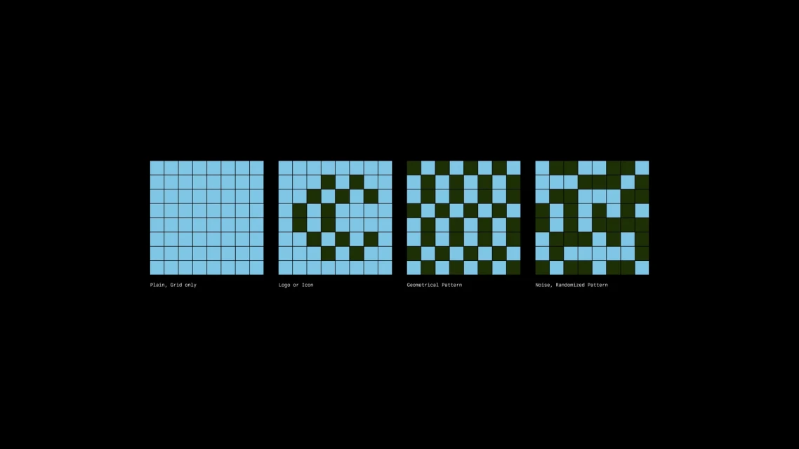
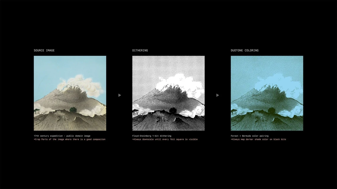
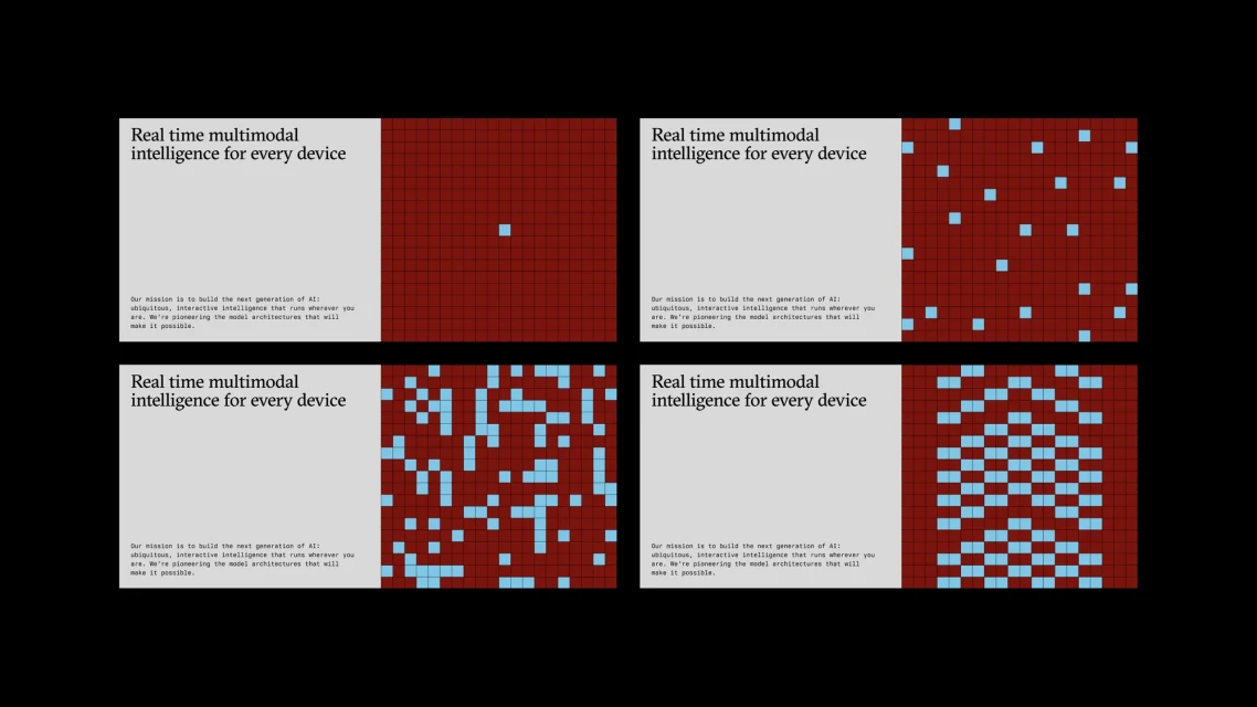
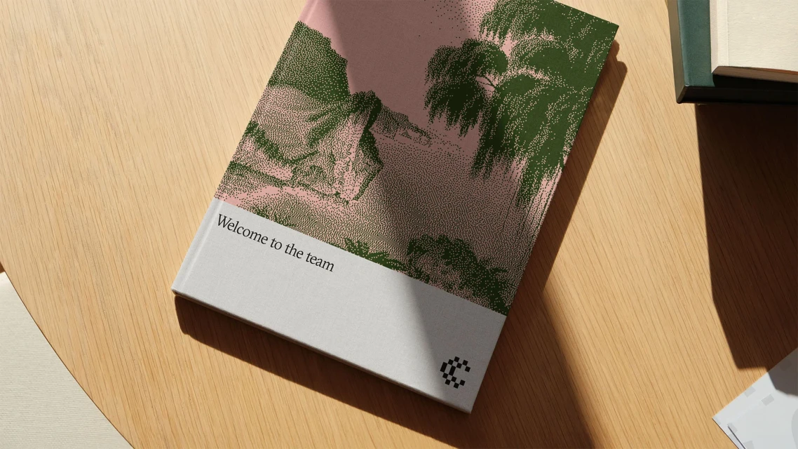
Cartesia’s brand identity, developed by ODA, centres on a modular visual system that bridges historical print aesthetics with contemporary digital concepts. The project leverages a distinctive graphic design language, utilising retro dot-matrix patterns, halftone illustrations, and Floyd-Steinberg dithering to represent the complexities of multimodal intelligence. The identity system is anchored by a structured grid and a restrained colour palette of forest greens, cyan, and muted earth tones. Across both print collateral—including minimalist business cards and onboarding booklets—and digital interface mockups, the design employs a clean typographic hierarchy. Motion graphics further expand the brand's reach, featuring pixel-based animations that reinforce the technical, data-driven nature of the technology platform.
Horizontal, Graphic, Commercial
Typography
Apps & Digital Platforms
Advertising Campaign
