
Can-Tini
Brand Identity

Jun 2023
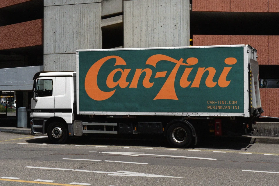
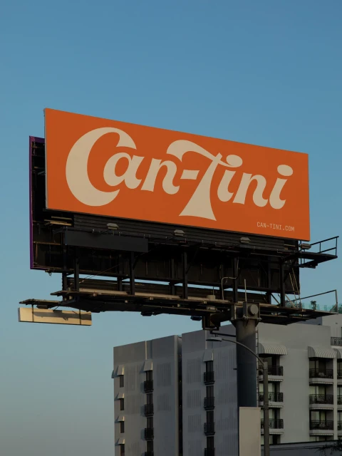
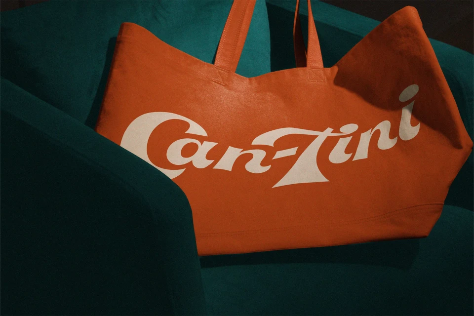
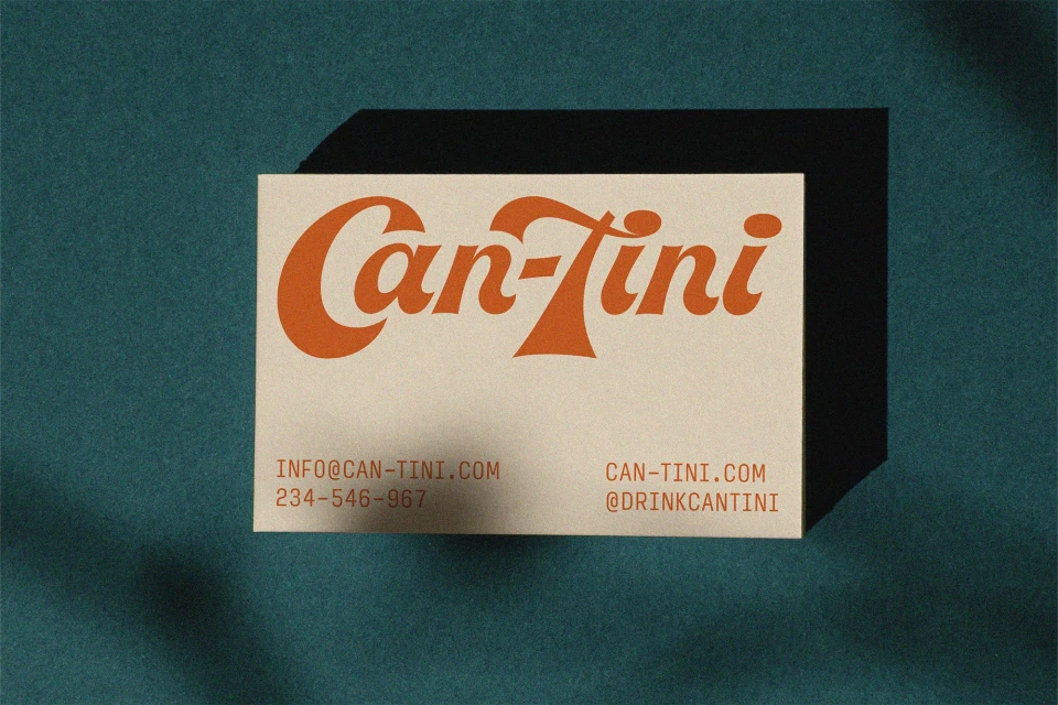
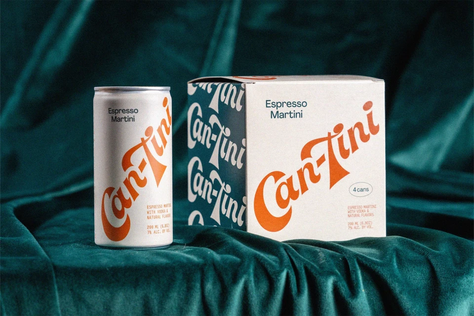
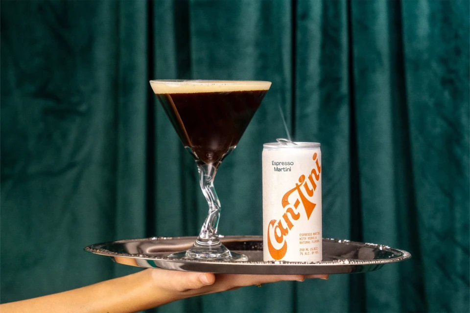
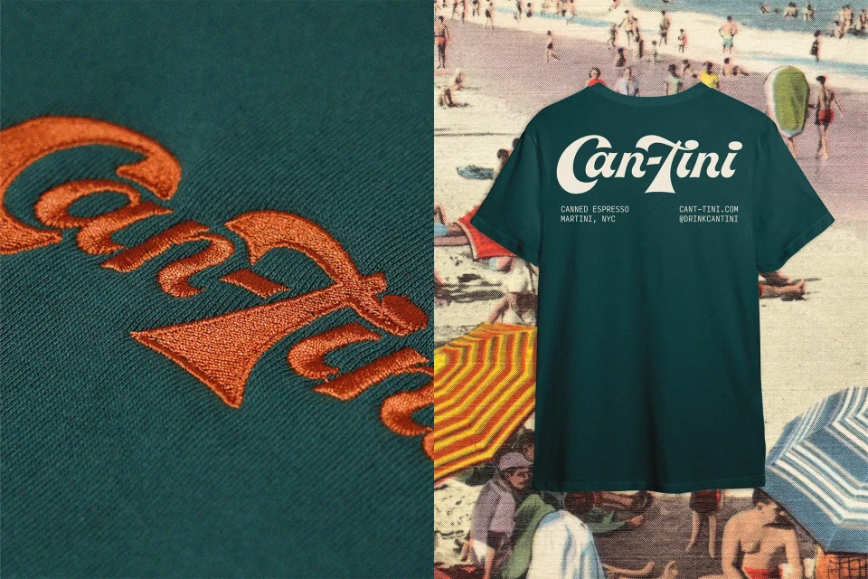
The brand identity for Can-Tini establishes a visual system centered on bold, retro-inspired typography and a high-contrast palette of orange, deep green, and teal. Saint-Urbain led the graphic design, translating the brand's aesthetic across a diverse range of touchpoints including product packaging, apparel, and motion graphics. The project incorporates a tactile approach to beverage branding, pairing clean, minimal logo application with rich textures like velvet curtains and embroidered textiles. The visual narrative extends from static product photography and environmental shots, such as urban outdoor signage and delivery fleet liveries, into live-action sequences and minimalist motion graphics that highlight the product's preparation and consumption.
Horizontal, Commercial, Clean
Beverages
