
Burnt Oak
Brand Identity
Dec 2017
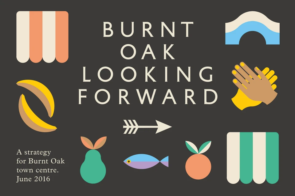
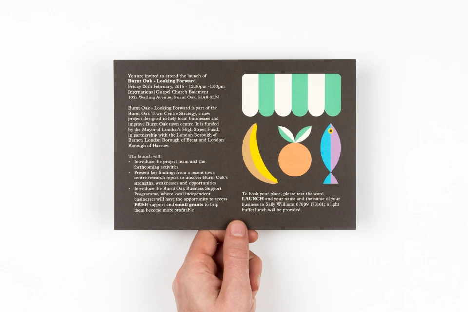
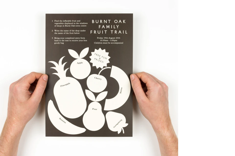
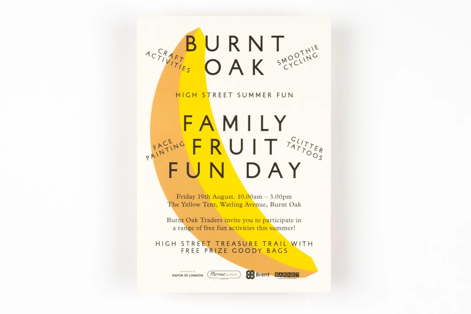
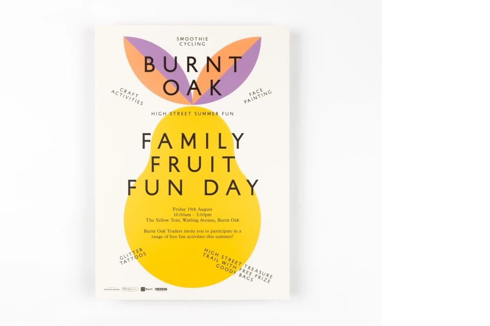
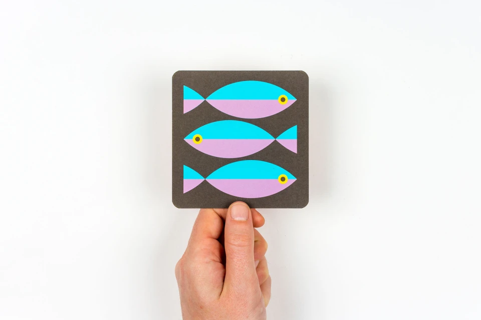
The brand identity for Burnt Oak masterfully balances civic responsibility with a vibrant, community-focused aesthetic. Developed as a comprehensive visual strategy, this project navigates the complex task of representing a town centre through a lens of accessibility and modern playfulness. By eschewing overly formal municipal tropes, the design leans into a clean, minimalist approach that centers on flat vector illustrations and a warm, punchy color palette. The execution, spearheaded by Maddison Graphic, effectively utilizes recurring motifs like stylized bananas, striped awnings, and geometric fish to anchor the visual language across various corporate touchpoints. Whether manifesting as a structured strategy document or a lively Family Fruit Fun Day event poster, the work maintains a rigorous consistency through its balanced compositions and bold sans-serif typography. The reliance on vector-based assets ensures that the identity remains sharp and scalable, allowing the brand to pivot between professional corporate announcements and engaging community invitations with ease. Throughout the series, the use of high-contrast color pairings and intentional white space highlights the strength of the graphic design, creating a sense of cohesion that feels both professional and inviting. Ultimately, the project demonstrates how high-level commercial branding can act as a catalyst for local engagement, turning a municipal initiative into a recognizable and approachable public identity that feels genuinely rooted in the spirit of the community it serves.
Artistic, Clean
Vector
White Seamless
Advertising Campaign
