BSJ treats labels like filing documents: Brand Identity

May 2026
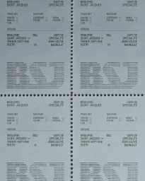
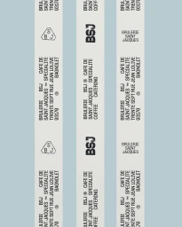
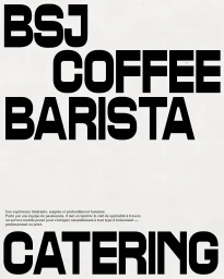
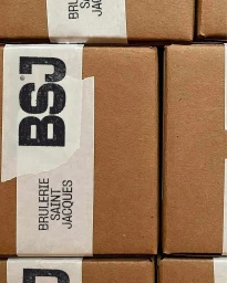
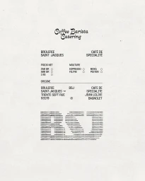
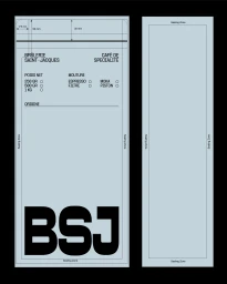
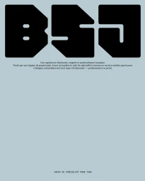
The brand identity for Brulerie Saint-Jacques, crafted by Studio Avenir, leans into an industrial, administrative aesthetic that disrupts the standard visual language of the specialty coffee industry. By treating labels like filing documents, the project utilizes a stark, high-contrast design system that feels less like marketing material and more like an official technical dossier. The creative direction emphasizes a modular, functional approach, employing bold black sans-serif typography against clean, off-white or pale blue backdrops to communicate professionalism and precision. This minimalist framework is applied consistently across various assets, from perforated label sheets that resemble government forms to technical packaging layouts featuring distinct checkbox fields for weight and origin. The use of repetitive geometric logos and sharp, vector-based design elements anchors the brand in a space of modern, corporate utility. Even in applications such as ceramic espresso cups or stacked shipping boxes, the studio maintains an unwavering commitment to a symmetrical, flat composition that prioritizes structural integrity over decorative flourish. The result is a highly disciplined visual identity that effectively balances the informality of a mobile catering service with the rigorous, paper-driven documentation of traditional production. This intentional focus on negative space and clean lines positions the identity as a standout example of commercial typography, where the act of ordering and labeling becomes a primary brand statement.
Artistic, Vertical, Clean, Minimalist
Typography
Advertising Campaign