
Block: Brand Identity
Mar 2019
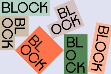
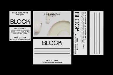
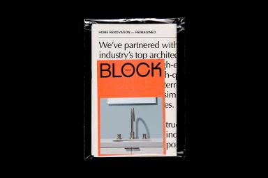
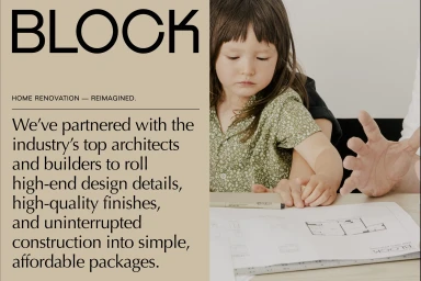
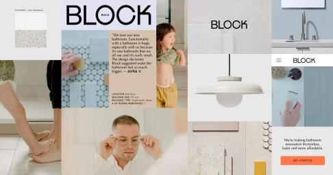
The new brand identity for Block, a forward-thinking player in the real estate and home renovation sector, masterfully balances architectural rigor with an approachable, human-centric narrative. Under the expert graphic design guidance of Noemie Le Coz, the visual system pivots away from the sterile tropes of property services, favoring a sophisticated blend of typography and structural geometry. The identity utilizes a bold, clean sans-serif typeface that anchors the brand across various touchpoints, from sleek corporate stationery suites to high-contrast promotional collateral. By layering muted pastel palettes against stark black and white compositions, the design language channels a contemporary editorial aesthetic that feels both curated and accessible. The project strategically integrates UI illustration and vector-based graphics to emphasize precision, yet it remains firmly rooted in the lived experience of renovation through natural light photography. These lifestyle elements, featuring candid moments of collaboration over floor plans, bridge the gap between technical service and family-oriented domesticity. The resulting aesthetic is one of deliberate clarity, where professional, high-end commercial branding meets the warmth of a modern home. This cohesive identity succeeds in positioning Block not merely as a service provider, but as a design-forward partner capable of translating complex architectural needs into a streamlined, visually evocative experience that stands out within the competitive property market.
Horizontal, Commercial, Minimalist
Typography
Advertising Campaign
